So weight loss isn't always linear.... who knew?

opal24
Posts: 205 Member
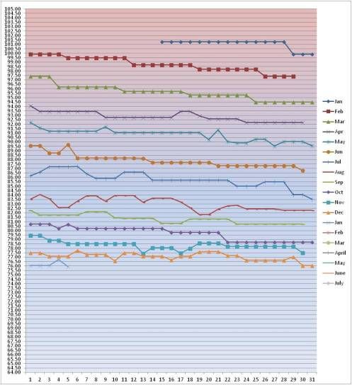
This is my first attempt at posting a pic, so fingers crossed that it worked!
I thought it might help new members to see that even when you have long stretches of no movement, or even the odd time of upward movement, if you stick to the programme then over the long term it really will work.
The graph is my daily weight from January 2012 to January 2013. I decided at the beginning to take it slow and steady and just keep plugging away at it - I'm now nearly 30 kilos (70 poiunds) down from my heaviest weight, with 12 kilos (around 27 pounds) still to go.
Edited to add - interesting how it's done exactly as you'd expect and slowed down as I've got closer to goal. Have just taken a break over the holidays and am hoping that'll kick start me again for the last few kilos!
0
Replies
-
Good point. Slow and steady wins the race.0
-
What a great visual of something we all probably know but is so hard to "feel" in the short term. Thanks!0
-
My weight loss looks like a broken fkn zipper :grumble:
Where/How did you make this chart?0 -
Awesome example, Christine! I love where your mind is at. This is helpful even to those of us who aren't new but who are trying to rekindle that motivation we once had. Thanks for the post, love.
 0
0 -
My weight loss looks like a broken fkn zipper :grumble:
THAT IS FREAKING HILARIOUS!!! You obviously have a great sense of humor LOL0 -
My weight loss looks like a broken fkn zipper :grumble:
Where/How did you make this chart?
It's just an Excel spreadsheet - days along the top, months down the side, enter the weight each day and use the chart wizard to make your graph.
I have weekly one as well....... I just love having a way of 'seeing' how the loss is going!
I also find that it helps me not to freak out about any slow patches or upwards movements because I know the downward movement will still happen at some point.0 -
Thanks for that, very interesting.0
-
:drinker:THAT IS FREAKING HILARIOUS!!! You obviously have a great sense of humor LOLIt's just an Excel spreadsheet - days along the top, months down the side, enter the weight each day and use the chart wizard to make your graph.
Ohh, Excel :sick: haha. Great idea though!0 -
My daily graph is incredibly volatile, but fits nicely to a line over time. Good idea to post the graph. I'll do that myself when I'm back at a computer.0
-
This is really cool, thanks for posting. Everyone expects this solid downward slant and it's just not that simple. Losing fat is a definitely a test of patience and perseverance. Great work.0
-
cool thanks!0
-
I love this - I just went and started my own graph to track my progress. Thanks for sharing!0


This discussion has been closed.
Categories
- All Categories
- 1.4M Health, Wellness and Goals
- 398.3K Introduce Yourself
- 44.7K Getting Started
- 261K Health and Weight Loss
- 176.4K Food and Nutrition
- 47.7K Recipes
- 233K Fitness and Exercise
- 462 Sleep, Mindfulness and Overall Wellness
- 6.5K Goal: Maintaining Weight
- 8.7K Goal: Gaining Weight and Body Building
- 153.5K Motivation and Support
- 8.4K Challenges
- 1.4K Debate Club
- 96.5K Chit-Chat
- 2.6K Fun and Games
- 4.7K MyFitnessPal Information
- 17 News and Announcements
- 21 MyFitnessPal Academy
- 1.5K Feature Suggestions and Ideas
- 3.2K MyFitnessPal Tech Support Questions