Feedback on a website I am designing

Addis_Daddy12
Posts: 548 Member
I am designing this website and its still under construction. Like there is not text on the home page and what not. But I wanted to just get some general feedback on it.
http://www.ontapradio.net
http://www.ontapradio.net
0
Replies
-
Easy to navigate, I'm not crazy about the microphone background but I think it's just me. It's obviously pertinent to the subject at hand.
Do I get to correctly guess your name in the name guessing thread now? that is you, right?0 -
yeah you can call me out in the name thread game....but the name on the website is fictitious. its a mic name0
-
I can't really call you if that's not your real name! lol0
-
I can't really call you if that's not your real name! lol
") my real name is Russ 0
my real name is Russ 0 -
Now that I know, I'm not sure I can bring myself to cheat. lol0
-
I like the retro look of the site, and you and your friend look cheerful and interesting, and I want to learn more. Which is really good.
it's not totally clear what the site is about though... is it about beer? or bars? or music? There's no "about me/us" page, so I can't go there to find out what you're all about. Personally, I want to know what a site is about, i.e. the general theme, within about 30 seconds of landing on the page. If not, I'm confused. You have beer themed pages, and beer on tap, and "on tap" as the title, then you have a lot of music logos, so is that beer on tap, or music on tap? or both? "call the show" tells me it's some kind of video show... but I'm not going to watch it if I don't know what it's about. If it's just me not getting it because I'm a bit old and uncool, then you need an about me page to explain it.
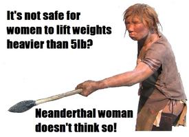
excuse the shameless link to my blog but I want to illustrate what I mean: http://cavepeopleandstuff.wordpress.com/ - it's immediately obvious by the title "cave people and stuff" and the subtitle "an imaginative look at palaeolithic life" and the picture of neanderthals at the top of the right hand column, that it's about cave people/palaeolithic life. People who are not into that can immediately navigate away, those who are can continue reading, and no-one's left confused and wondering what the blog is about. That's what I mean, your blog doesn't make it immediately clear what it's about. It may seem like overkill, but your regular readers/viewers will ignore the title and subtitle and just go straight to the content. People landing on your site for the first time need that title and subtitle so they know right away if it's a site that they'll like, and you'll draw the right people into your blog and get more readers/viewers.0 -
Yeah...that's why I wanted to include the fact that we are still under production. I haven't had the time to get a whole narrative placed on the homepage yet. I plan on doing that soon. It appears to be coming together piece by piece though0
-
Yeah...that's why I wanted to include the fact that we are still under production. I haven't had the time to get a whole narrative placed on the homepage yet. I plan on doing that soon. It appears to be coming together piece by piece though
okay that's cool. What is it about though? I'm genuinely curious.0 -
Oh I am sorry. Its an online talk radio show about beer and food0
-
sounds good
") I think the background image needs beer and food in it though, maybe make the radio image smaller. Or just pics of beer and food in general. I like the retro feel to it though, so don't change too much. 0
I think the background image needs beer and food in it though, maybe make the radio image smaller. Or just pics of beer and food in general. I like the retro feel to it though, so don't change too much. 0 -
Ok as a professionial web designer. A few bits
Background Image (MICS) - If you are boxing your content then maybe just have the mics to be on the edge of the content area. and not throughout the background as when your page is full you wont see what the background really is and will have gold lines on outside.
Header image - seems to be smaller than actual content box as has a border that doesnt really mix with image.
Nav - try to get the navigation to match something with the sight. Try a single line colour with the headings but have sub headings like this
Home
Personality Bios
Guest Bios
Listen Live
Brewsky Brothers Beer Corner
Brewsky Brothers Video Footage
Etc
Etc
Contact
hope this helps
Any other questions give me a shout.0 -
Ok as a professionial web designer. A few bits
Background Image (MICS) - If you are boxing your content then maybe just have the mics to be on the edge of the content area. and not throughout the background as when your page is full you wont see what the background really is and will have gold lines on outside.
Header image - seems to be smaller than actual content box as has a border that doesnt really mix with image.
Nav - try to get the navigation to match something with the sight. Try a single line colour with the headings but have sub headings like this
Home
Personality Bios
Guest Bios
Listen Live
Brewsky Brothers Beer Corner
Brewsky Brothers Video Footage
Etc
Etc
Contact
hope this helps
Any other questions give me a shout.
I'm more of a graphic design (logos/brand Identities) than a web designer but a lot of this pretty much sums it up. Sometimes what I do is find other websites that I find aesthetically pleasing, and figure out what works and doesn't work.0 -
I would consider taking your background into photoshop and changing it from it's current format to a 1 inch by 22 inch pic. that way your mic is not going to repeat across the background. It is visually distracting.
I would also say, possibly alter the text font to be something nicer than the same old, same old on the Personality Bios page. I am not big of reading white on black, but if you go either larger or for a more spacious font it can help.
I used to review blogs as Mutha on Ask and Ye Shall Receive. Man, I miss that.0


This discussion has been closed.
Categories
- All Categories
- 1.4M Health, Wellness and Goals
- 395K Introduce Yourself
- 44K Getting Started
- 260.6K Health and Weight Loss
- 176.2K Food and Nutrition
- 47.5K Recipes
- 232.7K Fitness and Exercise
- 444 Sleep, Mindfulness and Overall Wellness
- 6.5K Goal: Maintaining Weight
- 8.6K Goal: Gaining Weight and Body Building
- 153.2K Motivation and Support
- 8.2K Challenges
- 1.3K Debate Club
- 96.4K Chit-Chat
- 2.5K Fun and Games
- 4.2K MyFitnessPal Information
- 16 News and Announcements
- 1.3K Feature Suggestions and Ideas
- 2.9K MyFitnessPal Tech Support Questions