Exciting News: A New Food Diary is Coming Soon!

We're thrilled to share that in just a couple of months, we'll be rolling out a brand-new Food Diary page on the website!
Before the official switch, we're inviting you to take the new Food Diary for a test-drive and let us know what you think. This is your chance to be part of shaping the future of the Diary, and your feedback will help us ensure the transition is smooth and the new experience is even better for our community.
We'd love to hear:
- What you like about the new page
- What you don't like or find confusing
- Any bugs or issues you come across
Need ideas on what to share? Check out the first comment below for examples of helpful feedback.
Your input is incredibly valuable, and we're so grateful for your help in making the new Food Diary the best it can be.
👉️ To check it out, click the banner at the top of your Food Diary to try the new version.
✉️ To share your feedback, send us an e-mail here (or by clicking on the link in the banner on the new food diary page). Just use the subject line “Feedback: New Web Food Diary” and select "Feature Feedback" as the reason, and our team will find your comments quickly. Share what you love, don't love, or any bugs you find!
Thank you for being such an important part of this transition. We can't wait for you to experience the new Food Diary and to hear your thoughts along the way!
Replies
-
Thanks for helping us improve the new Food Diary! When you post here (or email us), a little detail goes a long way.
Here’s what helps most:
- Your use case: What were you trying to do? (e.g., "I always use the Quick Add option in the Quick Tools menu. When I try and do that....." or "I usually copy my lunch from yesterday's diary into today's diary. when I click to copy to/copy from button....")
- What you logged & how it logged: Include what meal you were trying to log to, names of foods/meals/recipes, and serving sizes.
- Step-by-step walkthrough: List the exact steps you took so we can reproduce it.
- What you expected vs. what happened: Works for both likes/dislikes and bugs.
- Visuals: Add screenshots (or a short screen recording) if you can.
- Your setup: Device, browser (and version), operating system, and any extensions/ad blockers.
⚠️ Please do not include personal information such as your name, email address, date of birth, or location in your feedback in our Community Forums. If you need to include any personal information, please provide feedback using our email option.
0 -
The new one is still inferior to the current one. The totals in the new one aren't distinct enough and it just looks jumbled up. The current (old) one is easy to read, and keeps meals more separated. Why mess with something that isn't a problem?
26 -
I just sent the exact same feedback. Did they not read the forum from the last time they tried to change it and had to change it back because it was so bad??!! Exact same issues with this attempt at an update! I certainly hope they will allow us continued access to the current version.
18 -
Way less info available on screen in new/beta version. Much prefer existing diary.
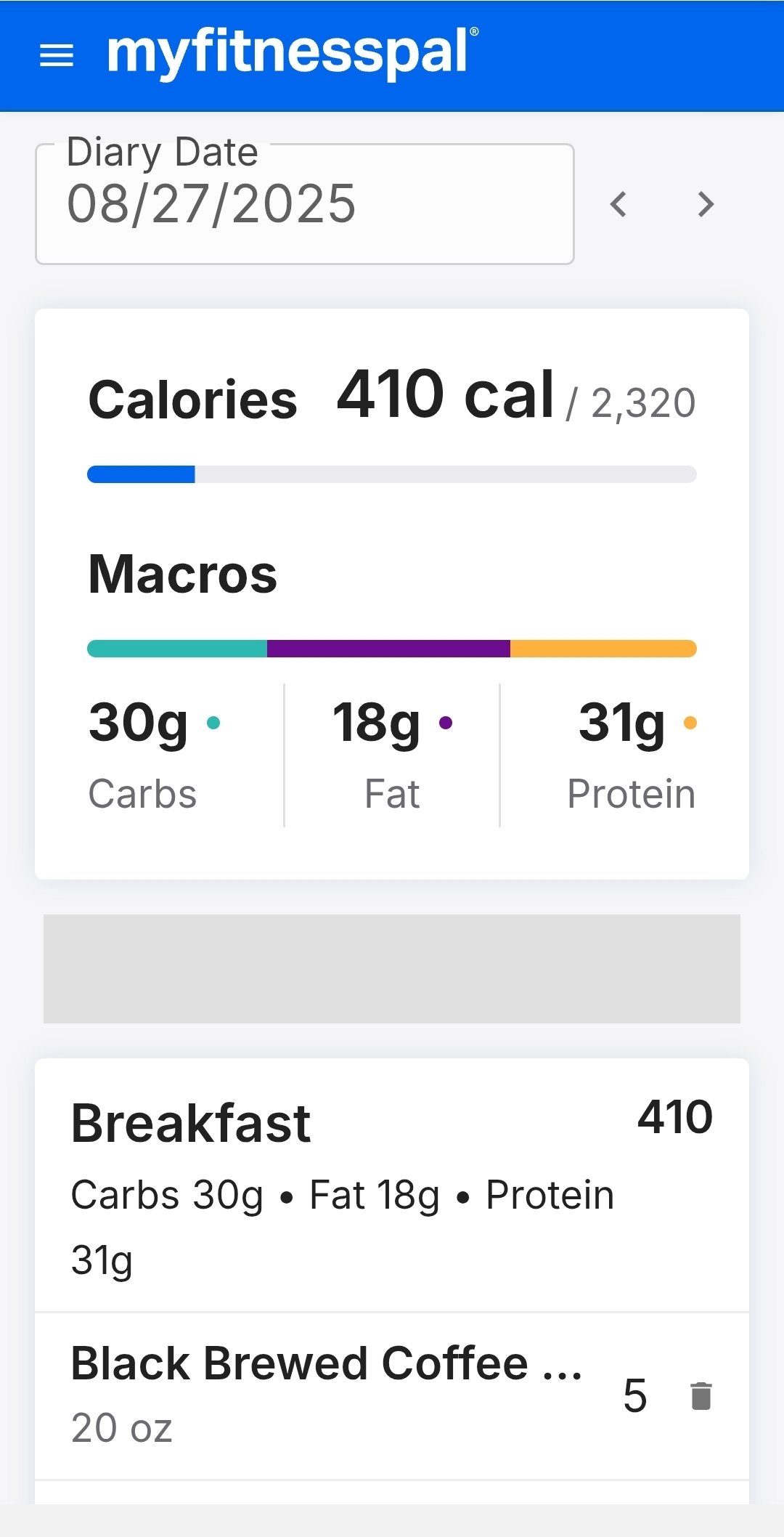
Using android website. Samples of what I see in new and old:
New - fewer macro/elements, truncates names of food and have to scroll to see items in meal (shows summary with main macros but not all 5 fields previously shown in current version.)
Screenshot of what I see with new version before scrolling to see detail.
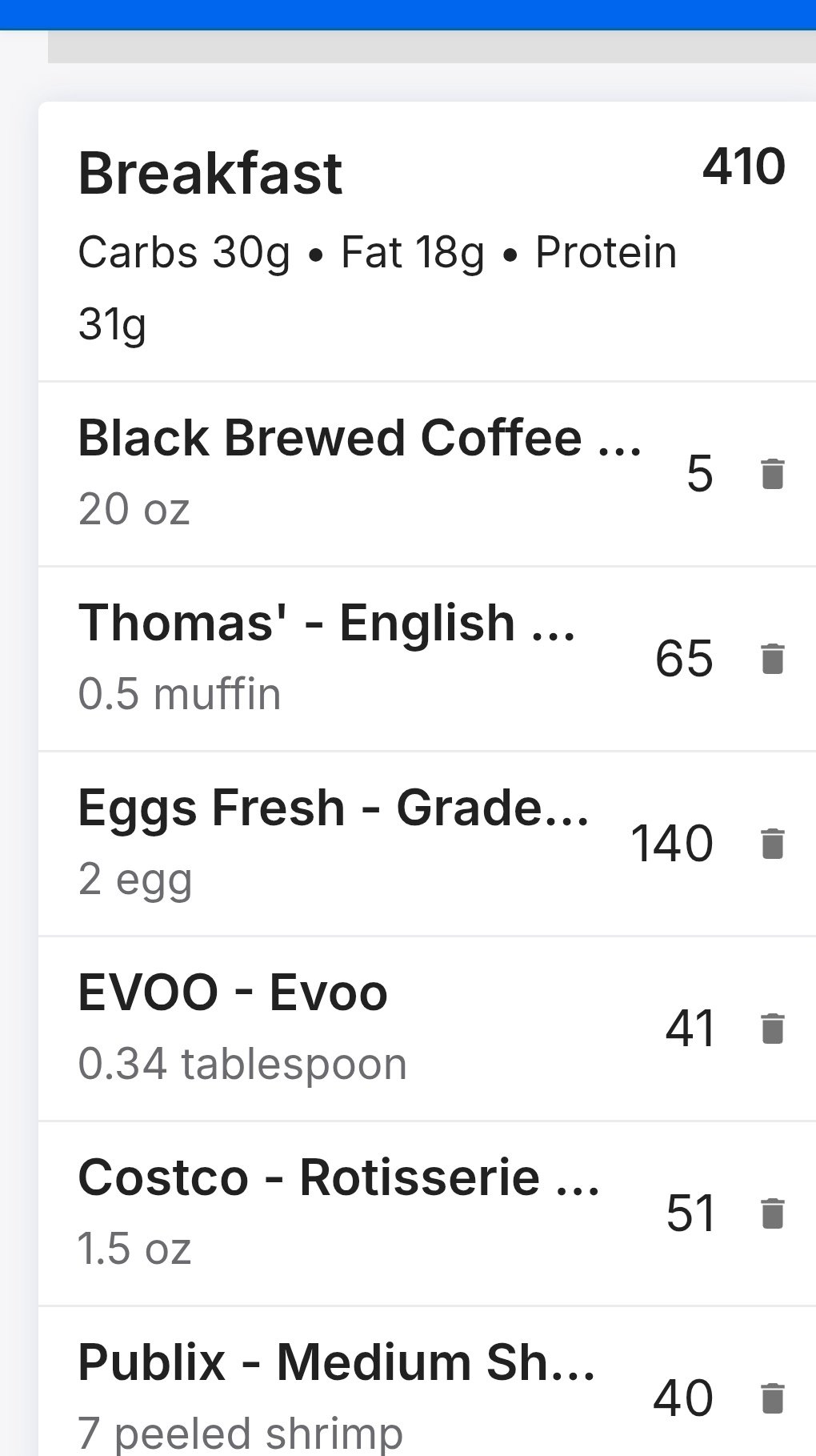
Here is the next scroll to show actual foods (with truncated names and info). I would need to scroll again to see and screenshot the rest in the meal (which i did not do next scroll.)
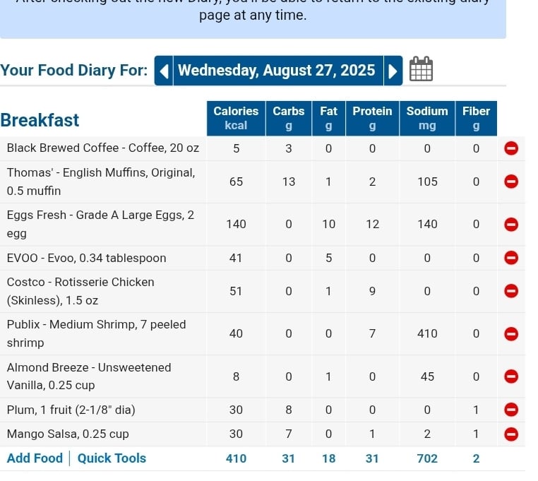
Current version screenshot next - has much more detail on screen without scrolling. Full detail for macros/elements tracked by item and full names of foods.
 14
14 -
TL;DR; / BLUF - It's terrible. Please don't change it to that abomination. There is very little to recommend it.
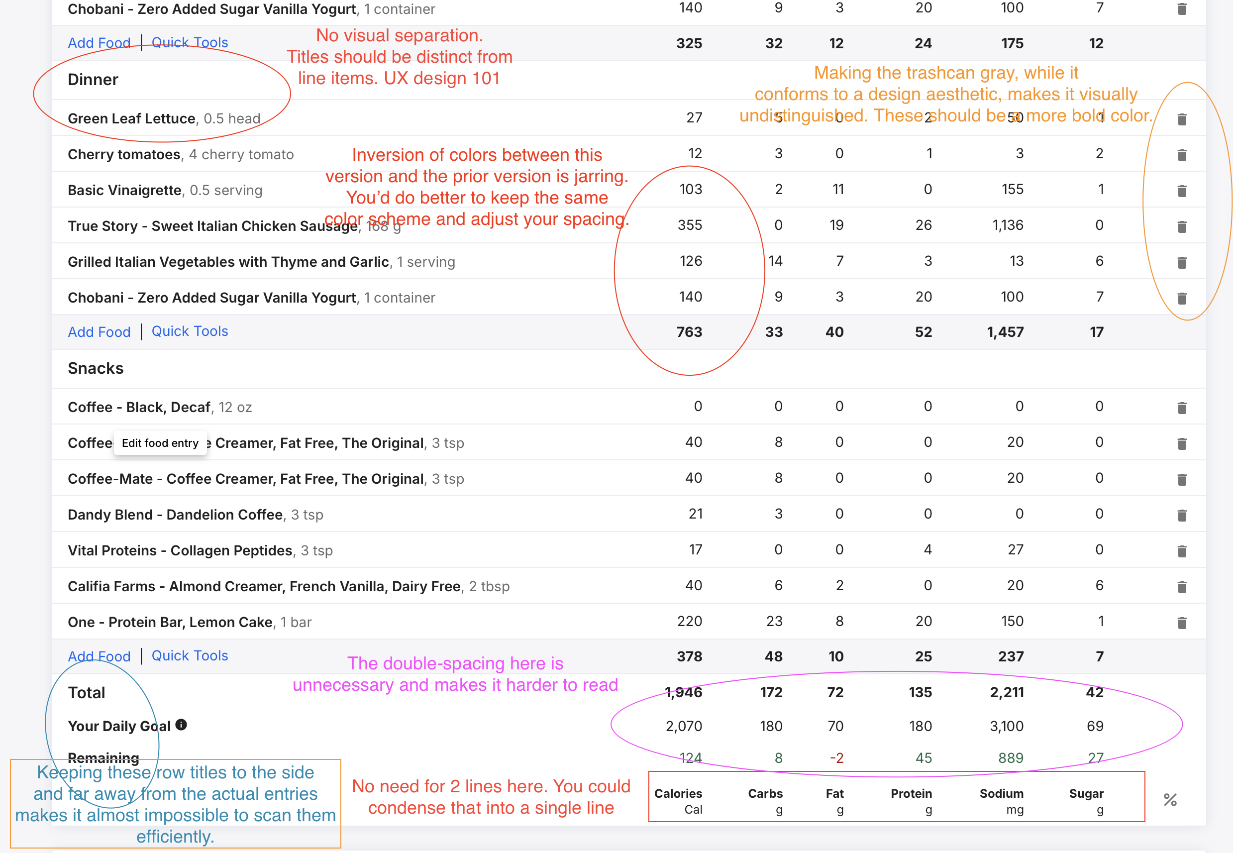
You've lost visual separation between section headers and the section items. The section item names should never be a bold font. The alignment of row titles for the summary section at the bottom is just wildly off. The use of color for the amount remaining has become far too muted, and the font size is far too small to actually see properly. By removing the bold font there, you've effectively reduced the font size.
You're wasting space at the bottom by having 1 1/2 spacing instead of single spacing. Inverting the grey/white between sections and section summary lines is the wrong way to go. By doing so, you lose the effect of the white column borders that allow you to more easily visually delineate between values in a row.
Using grey for the section summary line, which occurs immediately above the next section title ensures that your eyes go to that rather than to the section titles, which is far more desirable.
I literally cannot think of anything good to say about this revised design. It is fundamentally flawed and, if I'm perfectly honest, your UX designer should be admonished for this complete miss. If you desperately want to change your most important page on this web site, do it properly. Don't change it just because you want to change it.
 30
30 -
It is much less visually "friendly" to scan at a glance and see how your day is shaping up due in part to the peculiar spacing.
I can't see anything that is new or improved in terms of information or tools.
I really don't like the daily summary for calories and macro split being at the top of the page because it gets left behind as you move down the page.
In short - it offers nothing the current page doesn't do better, PLEASE DON'T CHANGE TO THIS VERSION.
11 -
where are my macro %?
where is my calories earned?8 -
I emailed as requested to let them know what I thought and got a reply about integration of Fitbit!!!! (I have a Garmin!!!)
I don't think they are listening to be honest. I hope they don't change to this as it's hideous but it seems to be a done deal if people who are emailing in get an automated reply about something irrelevant.
It's terrible, just like what fitbit did to their app and canned the web page. (Hence the Garmin)
9 -
Agreed, this is just terrible UI design that makes it harder to track what's been input. I also really, really hate the extra space added around everything and the oversized/bolded fonts; the extra space horizontally makes it harder to read and follow what number belongs to what entry, and vertically it makes it so that to view a whole day's logged foods, I have to scroll. Currently on my desktop I can see the whole diary in one screen, which is super convenient, and only have to scroll down to see the pie chart (which I love and would hate to see removed, it's a great way for visually-oriented people to see their macro percentage breakdowns, which is an important feature for me) and to log my water (also an important feature, and I absolutely hate the new horizontal bar for showing water consumption).
15 -
Prefer the older (current diary). On the old diary the blocks of blue with the totals contrast nicely with the rest of the tables in black and white.
The new diary doesn't do anything for me. Please keep the old one!
14 -
I believe that the old cliche fits nicely here…. "If it ain't broke, don't fix it!" The new version is visually unpleasing and is more difficult to decipher. Please reconsider making this change.
14 -
Was going to say what Alison said. If it ain't broke…. I dont like it . It doesnt have the wheel telling you the fat, carbs you have eaten.
7 -
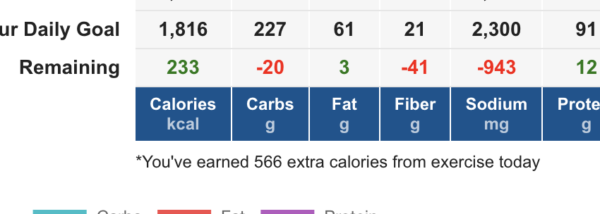
thanks for giving us a preview and a chance to provide input on this! I feel like it is a huge step forward to working with the users before dropping an update in. 👏
I noticed in the new to old that there is not a note about exercise cals earned anymore like there is in the current version. I can see that the calculation is included but it does not provide the info like below anywhere in the new version that I can find.
 5
5 -
I appreciate the opportunity to comment on the new diary layout for the web browser version of mfp, however I don't think it's any better than the previous one that was briefly introduced. The current layout is far superior and the new layout makes the user experience worse. Issues include:
The meal headings are lost in the sea of bold fonts. Once you starting adding foods to the page, the headings become difficult to distinguish from the food entries, which are also in bold fonts.
The current version has very good visual separation between meals, with the title in a coloured bold font, the foods in a small fine font but on a grey background, and the totals in a bold but small font at the bottom. These positive features have all been removed from the new layout.
There is too much space between the food entries compared with the current layout, which is far more compact.
The grey font used for the food quantities is difficult to read.
The daily goal and remaining calories entries at the bottom are rows that should be emphasised, and the new layout completely de-emphasises them. This is literally what users will be keeping an eye on, and you have made that harder.
The current version shows the outlines of the table cells, which help with vertical alignment. This has been removed from the current layout, and contributes to the overall difficulty in knowing where you are on the page.
Separating the progress graph (now at the top of the page) from the progressive calorie and macro totals is unhelpful. Leave the graph at the bottom where it is now so all this information can be viewed together.
Overall, I have nothing positive to say about this new layout. Please listen to users and leave the current one alone.
12 -
Massive step backwards. Everyone above has already covered the glaring issues with the new layout, which should have been canned after the feedback last time.
The question I'd love to be honestly answered about this change is: Why?
Why has so much time and money been invested in this change that users haven't asked for?
Why change one of the unique selling points of your product, that swung many users away from your competitors?
Why go ahead with this change when you've had quite literally no positive feedback so far?
Why sabotage yourselves when the competition is doing the opposite?
I'm sure MFP are aware of their competitors in the market, so I'd like to think they know that people won't hang around if you make your product measurably worse.
12 -
I like it!:D
Simple & perfect for what I need it for..
0 -
I do like the quick tools on the original next to the add food / would like to change the top part to reflect goals calories, sugar and fat instead. But still seems simple to use for meal planning and storing a few recipes. So
😄👍
0 -
Two words - Cracker Barrel
10 -
It's absolutely terrible. Others have listed the reasons why and I agree with all of them. The worst features for me are 1) The mobile version on my Android is totally unusable 2) As user LiJaHi pointed out, the remaining calories and other remaining elements are de-emphasized. Remaining calories is the first thing I want to see when I bring up my food diary and I'm sure I'm not alone.
Please listen to your user feedback and don't change this! Or at least let us use the current version if you do change it. If I'm forced to use this diary, I will cancel my account and find another calorie tracker. There are plenty to choose from. It will be painful, as I've put a lot of time and energy into creating recipes, and MFP has the best food database, but I literally cannot if you go with this new version.
11 -
Okay soOkay so I try to click the banner at the top of the Diary as a premium user and there is no option for trying a new one. Then I try sending you my one main plea- to be able to copy an item from one day to another not just a whole meal! - and when I click submit I get web page not found. Pretty darn frustrating!
1 -
Change that fixes a problem or makes a process easier or quicker is great, but change just for the sake of change is usually pretty worthless.
8 -
Lots of good feedback here, but just to pile on: It's really really bad. Please do not change to the new design.
9 -
100 percent all of this
7 -
I normally wouldn't bother leaving a comment, but the new food diary is just a straight up regression on what we already have. There's no reason to force people to change, is there? At least let us have the option to keep the current layout.
6 -
Why on earth is the "Remining" the least emphasises metric? So much over-use of bold, and yet the really important thing - How many calories do I have left? - is pale and small and lost at the bottom.
5 -
If this is the new app, it sticks, food I eat almost daily is gone, yet food I haven't eaten in years is still there. I am not at all happy with this change.
6 -
As mentioned in my email, I absolutely detest the new layout and without being given the opportunity to continue using the old version, there's no way I'll continue with mfp. What a shame you couldn't listen to your client base the first time round.
7 -
Nobody asked for it, nobody wanted it, and yet here we are, staring at something that looks like a cross between a spreadsheet, a kid’s coloring book, and some dodgy calorie tracker you’d delete 10 minutes after downloading back in 2011.
The old diary worked because it was clean and efficient. Open it up—meals separated, numbers pop, totals clear. Done. Easy. Now? Everything’s jammed together, the important stuff is practically in hiding, and scrolling through it feels like punishment for trying to log your lunch.
This isn’t an upgrade—it’s straight-up vandalism. You’ve taken the best part of the app and wrecked it.
And if your UX team honestly thought this was good design, they should probably stick to drawing IKEA manuals, because food tracking clearly isn’t their thing.
Stop fixing what isn’t broken. Nobody asked for this, nobody likes it, and if you push it out anyway, people are going to leave.
17 -
can we ask when this new diary is going to start rolling out? I do hope that the comments here and on the feedback part are being taken in to account so that the formatting can be updated a bit to make it easier.
4 -
Hideous! The “new & improved” is optimized for the phone. Not everyone does everything on the phone! On my iPad everything gets scrunched to one side. And don’t get me started on integration into Fitbit.
6


Categories
- All Categories
- 1.4M Health, Wellness and Goals
- 398.2K Introduce Yourself
- 44.7K Getting Started
- 261K Health and Weight Loss
- 176.4K Food and Nutrition
- 47.7K Recipes
- 233K Fitness and Exercise
- 462 Sleep, Mindfulness and Overall Wellness
- 6.5K Goal: Maintaining Weight
- 8.7K Goal: Gaining Weight and Body Building
- 153.5K Motivation and Support
- 8.4K Challenges
- 1.4K Debate Club
- 96.5K Chit-Chat
- 2.6K Fun and Games
- 4.8K MyFitnessPal Information
- 12 News and Announcements
- 21 MyFitnessPal Academy
- 1.5K Feature Suggestions and Ideas
- 3.2K MyFitnessPal Tech Support Questions