Exciting News: A New Food Diary is Coming Soon!
Replies
-
After 10 years with myfitnesspal this may be the end. Listen to what the people are saying. Don't mess with the current food diary and bring in something worse. Way worse if the last attempt was an example.
4 -
What I really like is that MFP introduced a viable method for giving users a chance to comment on a future change. In my 40 years of designing and implementing information/data systems, a user forum on change was always a necessary component. I hope it becomes standard practice for MFP.
0 -
I don’t see a banner at the top of my food diary.
0 -
You should see it at the top of this page, on the website: https://www.myfitnesspal.com/food/diary
0 -
I am seeing some changes already based on our feedback!! thank you for putting the exercise calories back in a visible place again! 👏👏👏
1 -
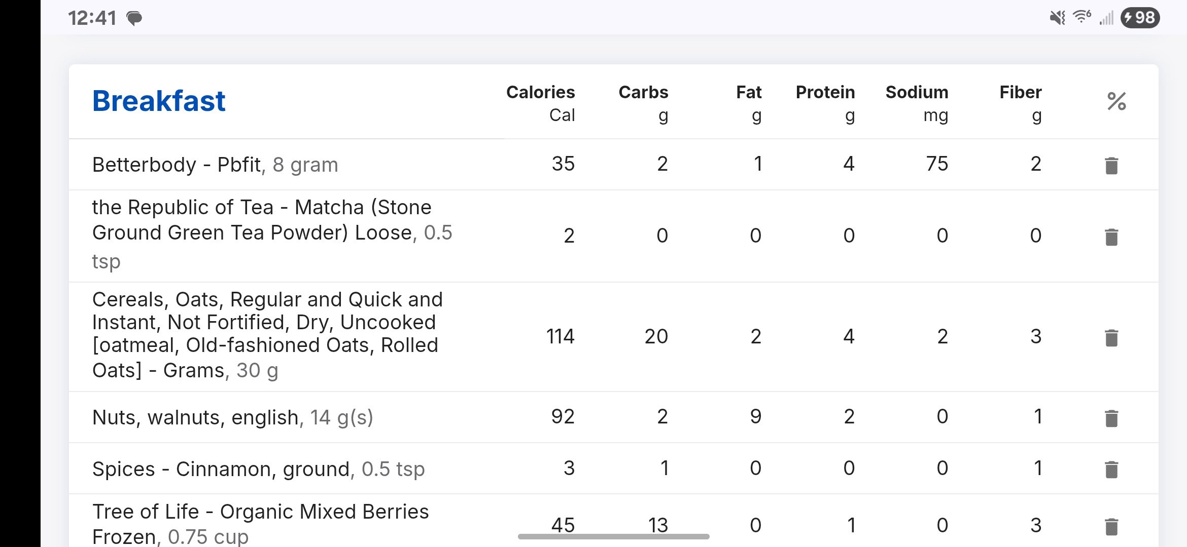
The printable report is also full of dead space and becomes unusable.
Screenshot - only able to view 1 partial item at a time - not in entirety. Table titles scroll off when moving further to view more items.
This is landscape - Android phone, website version. Portrait shows even less.
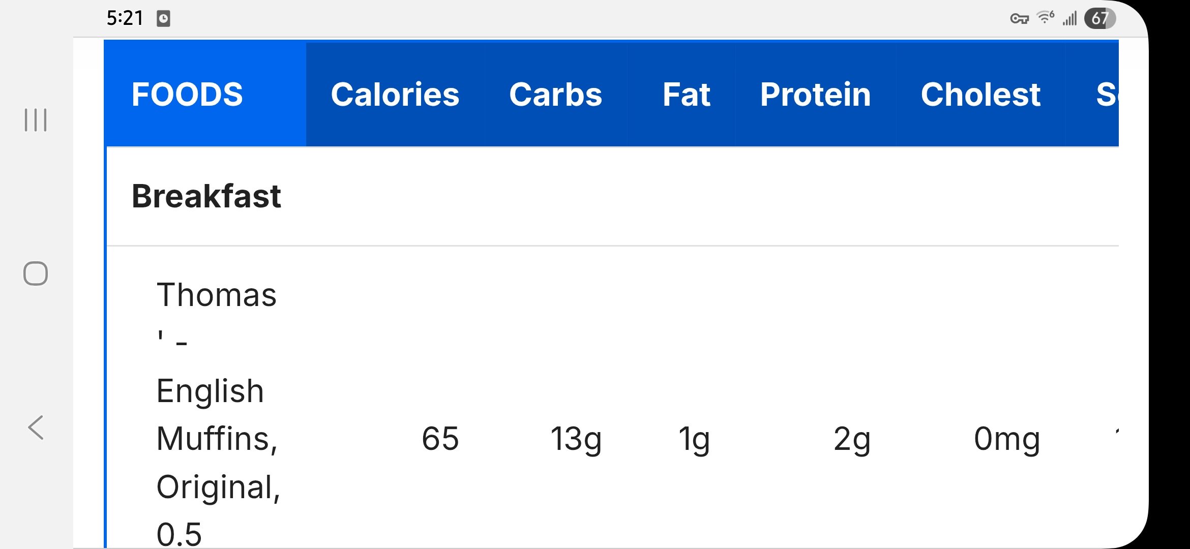 2
2 -
🔔 Update from the MyFitnessPal Team
Thank you to everyone who has shared feedback so far — both here in the thread and via email. 💙 We've been reviewing everything closely, and your input is already helping us shape the new Food Diary.
In fact, we've started making some changes based directly on your suggestions. For example, one of the top themes we heard was that members wanted meals (breakfast, lunch, dinner, etc) to be easier to visually distinguish. We've updated the layout to make the separation between meals clearer, and we'll continue to refine based on your feedback.
We’ll make some more changes to the new Diary over the next couple of months, and your ongoing feedback is key to making it better. Please check back periodically, try out the updates, and let us know if you have additional thoughts.
Your voices are helping us build a Food Diary that truly works for our community. Thank you for being part of this journey! 🙌0 -
Is there any chance that the new version could include something similar to the "Edit Diary" function in the Android app, where it takes fewer clicks to delete a whole meal or whole day, rather than individually deleting each individual food line by clicking the minus sign?
1 -
If it's anything like the "new and improved" app version, it's going to be hot freaking garbage. I've use MFP for 11.5 years and I'm about this close to deleting it. Using the diary now is absolutely, brutally, painful. All of my frequently used foods, just gone. I can enter a food item yesterday and not have it show up in my recents today. I am basically having to re-find foods on a daily basis, after spending over a decade curating and verifying the entries I used.
4 -
To the My Fitness Pal Team -
Can you let me (us) know what problem (s) you are trying to fix with the new diary? I know people don't like change but IMO, the existing diary works well and I don't see any need to change it.
3 -
Please allow for a zero to be used as quantity. I like to leave my most often eaten foods in my meal lists. If I don't eat a food on a certain day, I change the amount to zero. This saves me having to delete the food and then when I need to record it again, having to scroll to find it and readd to my list.
It would also be nice to be able to search inside my own lists, as opposed to monster list that everyone shares.
1 -
Do NOT like the new version. I have been using the original version of MFP for 20 years quite successfully. Need to see individual food macros, not just a summary for a meal in tiny print. Seeing macros on individual foods helps us to see the values--both good and bad--which guides us in future food selections. If I am unable to view individual food selection macros, I doubt I would continue to use MFP. What a shame that would be . . .
3 -
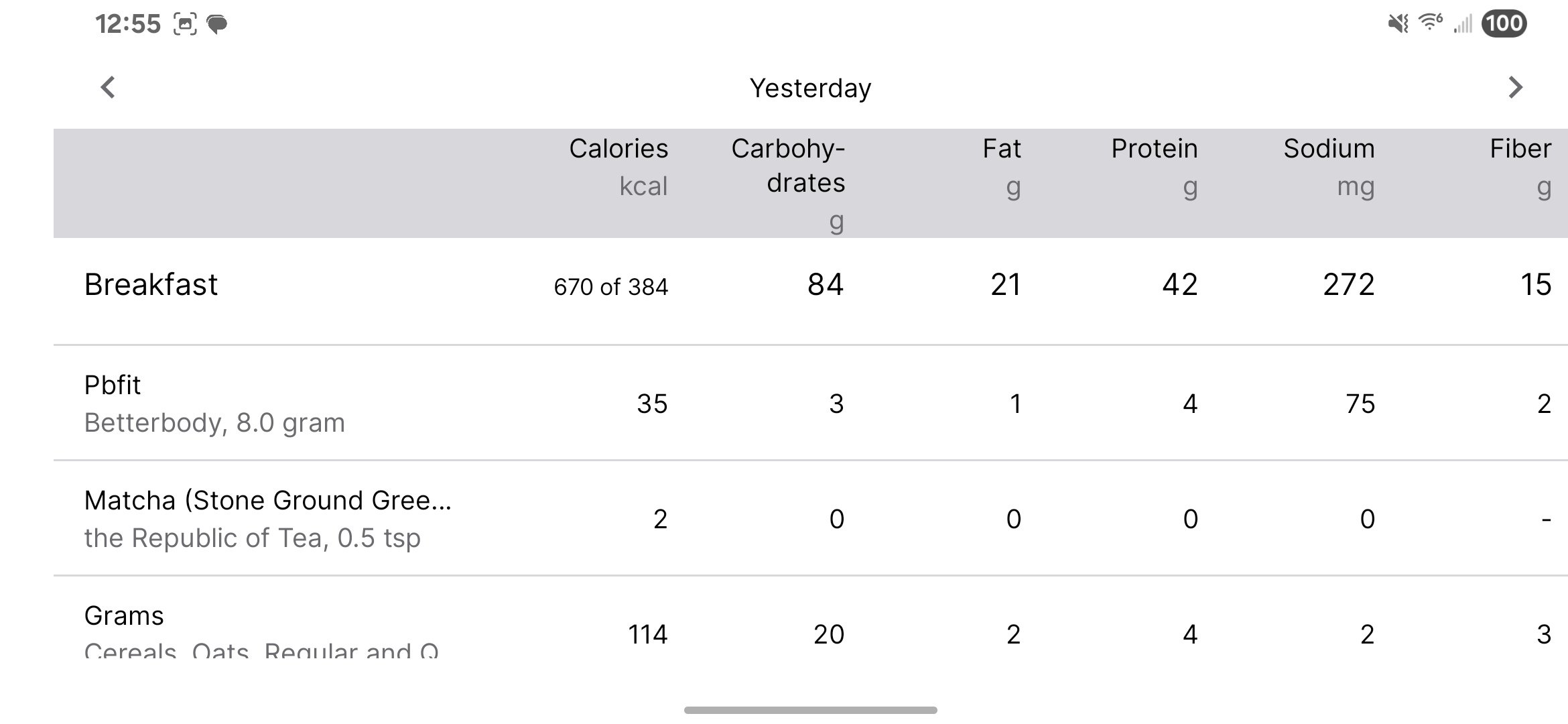
I'm confused. When I look at my diary page via the link for the new format in the web browser version of MFP, below is what I see for each meal. It has the macros on each food line, just like it does now. You must be seeing something different?
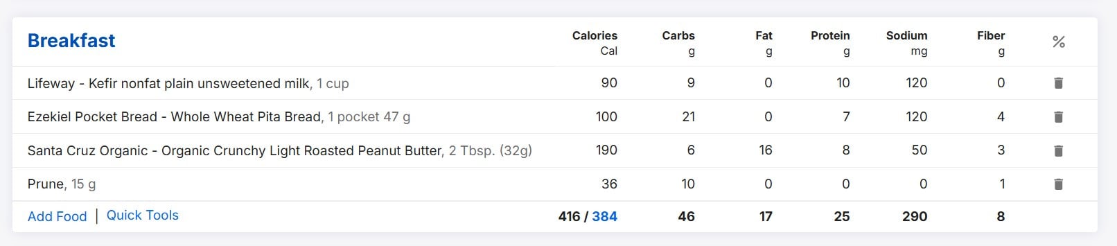
(Mine shows fiber instead of sugar in the right-most nutrient column because I changed it from the default.)
0 -
This is mine - only a glimpse - requires inordinate scrolling and memory banks.
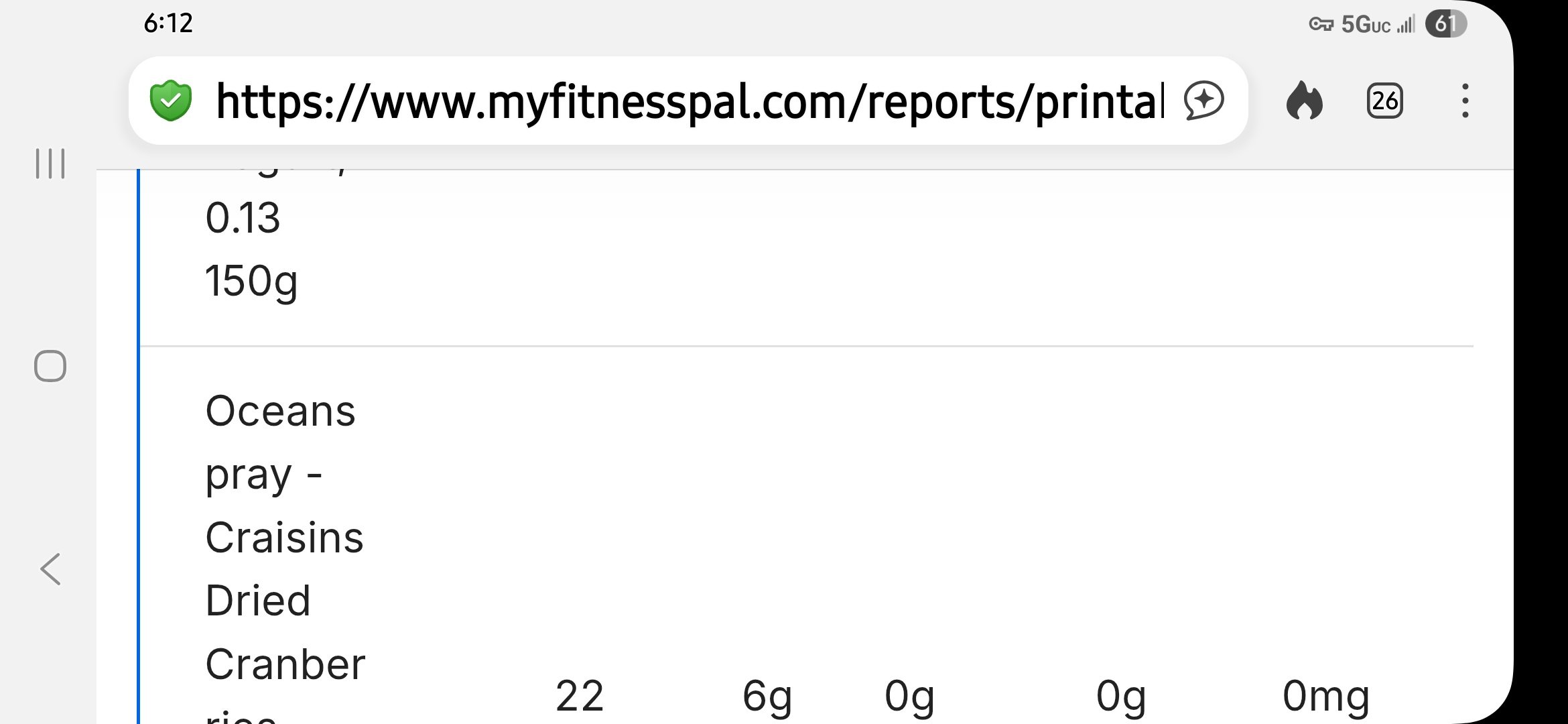 0
0 -
Is that because you're looking at a printable version? The URL for my food diary is - you seem to be looking at reports?
0 -
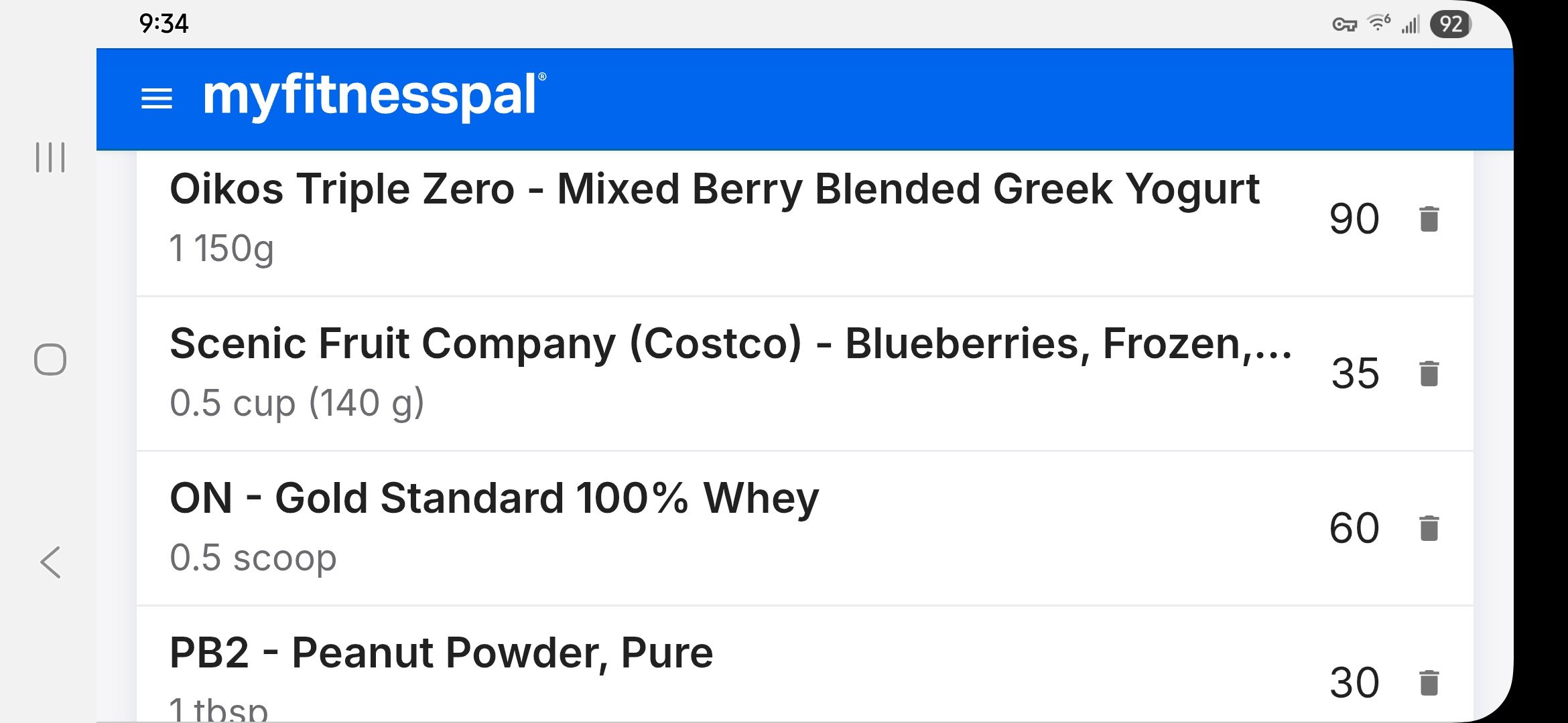
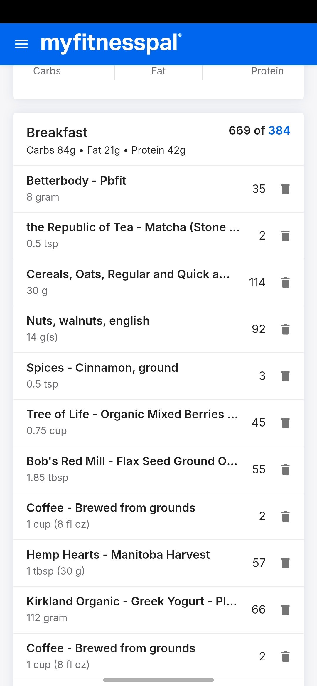
Perhaps they're testing different versions? Mine only has macros for the meals, not the individual foods (only amount and calories), which certainly isn't how I would want to see my food diary.
1 -
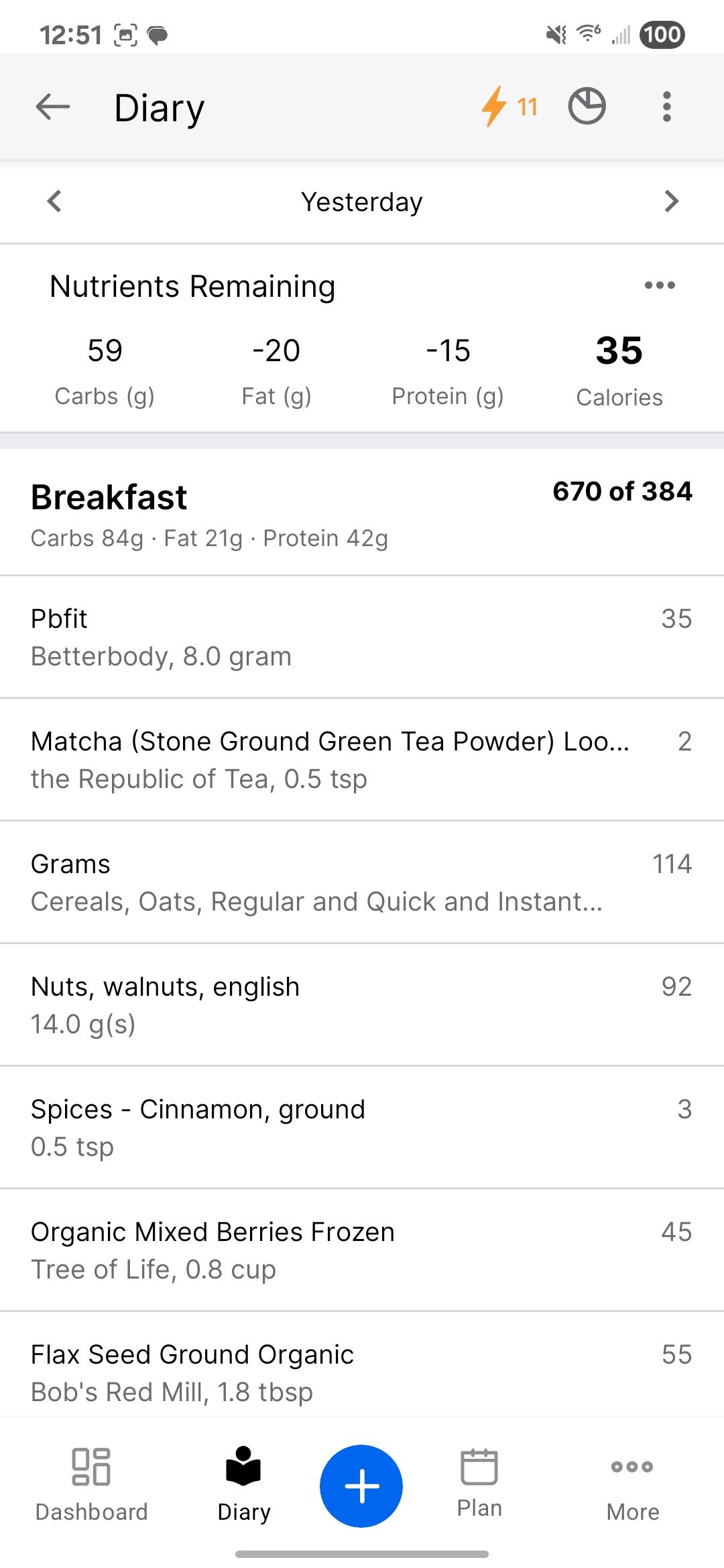
Yes. That was report. This is landscape diary. Still requires scrolling with no overview like original.
 1
1 -
Are some of you looking at the web browser version of MFP on a phone or tablet? I think it would be relevant, if reporting problems to MFP, to say what version you're using, in what environment, and what page you're looking at like diary vs. reports.
In the way I usually look at my diary - the Android version of the MFP phone/tablet app, portrait mode - I don't see macros per food line. I can understand why someone might want that, though, especially someone newer to MFP than I am. (I'm in long-term maintenance, been logging most days for over 10 years, so I have a general idea of eating patterns that work well without managing details daily .)
The screen shot I posted above was from a web browser on a laptop. On the phone app, Android in my case, I don't have a banner at the top of my diary page to see a new format, so I assumed the phone/tablet app's format wasn't changing, or at least not in Android.
The OP of this thread says ". . . rolling out a new Food Diary page on the website." (emphasis mine) That seemed to confirm my assumption we were talking about the web browser version,
Even if I skip the app on my phone - a thing I never do routinely - and log into the web browser version there (using Chrome on Android), I get this in landscape mode:
. . . but this in portrait mode, which is more like what some of you are reporting:
I just screen shot the meal part, not the header/trailer part.
That screen shot just above - the new format, web browser version of MFP in Chrome/Android, looks very similar to what I already see in the Android version of the MFP phone/tablet app shown below, i.e., I'm not seeing macros per food line in the app in portrait mode. However, a very important difference is that if I click the food in the new web browser portrait version, I get a pop-up where I can change the quantity, but in the phone/tablet app that also lacks per-line macros, I get a page that lists the nutrition for the food item. This is the screen short of how the Android phone/table displays the diary in portrait mode:
If I switch the phone/tablet app into landscape mode, I get all the macros per line, but in a strange format where I need to scroll sideways to see the end of the day. I never put the phone app in landscape mode, because if I care about what's in a food, I can simply click the food line to find out, as mentioned above. The top of the phone app's landscape display looks like this:
 0
0 -
🔔 Update from the MyFitnessPal Team
Thank you again for sharing your feedback on the new Food Diary. 💙 Our team has reviewed everything you’ve provided, and we’ll be making changes over the next few weeks based on the top themes we heard from you.
Please check back occasionally to see the updates as they roll out. We’re grateful for your help in shaping the new Food Diary and making it better for everyone.
2 -
Yes, all of my shares have been android phone on website (not app).
0 -
I submitted a response of the new version and mentioned that I can't see the overall daily Macro Percentage Pie Chart. They let me know they are removing this FREE feature and will allow you to hover over the new macro bar to see the macro percentage with a PAID subscription.
2 -
It has totally f'd up my use of the app and I cannot find a way to turn off the functionality. I have a "Plan" option at the bottom which I have not signed up for and cannot enter into the food diary as I have over time. I do not like what I see.
2


Categories
- All Categories
- 1.4M Health, Wellness and Goals
- 398.2K Introduce Yourself
- 44.7K Getting Started
- 261K Health and Weight Loss
- 176.4K Food and Nutrition
- 47.7K Recipes
- 233K Fitness and Exercise
- 462 Sleep, Mindfulness and Overall Wellness
- 6.5K Goal: Maintaining Weight
- 8.7K Goal: Gaining Weight and Body Building
- 153.5K Motivation and Support
- 8.4K Challenges
- 1.4K Debate Club
- 96.5K Chit-Chat
- 2.6K Fun and Games
- 4.8K MyFitnessPal Information
- 12 News and Announcements
- 21 MyFitnessPal Academy
- 1.5K Feature Suggestions and Ideas
- 3.2K MyFitnessPal Tech Support Questions