Please show us some Progress Graphs
Replies
-

3 month progress. I was weighing weekly at first, then everyday, then hit a plateau, but for some reason forgot to log the numbers, and I can't find where I wrote them down.. As of yesterday I will be logging daily again. Orange line is the trend, blue is the actual logged weight.0 -
Intake (blue) and weight (green) from about mid-February to today. I started tracking weight daily (what can I say; I like data) in March.

It's been a useful exercise for me. I've noticed predictable monthly fluctuations in both hunger and weight. I've also discovered that I seem to naturally "refeed" every couple of weeks, and that it has no discernible negative effect on my progress. The latest biggest spike up corresponds to a double-whammy combo of TOM and my first no-logging day that consisted of lots and lots of carbs and salty food - so piles of water retention. It's on the way back down now") 0
0 -
 0
0 -
Here's mine:
Red line is 2 lb/wk trendline
Green line is 1 lb/wk trendline
(I revised weight loss goals from 2 lb/wk to 1 lb/wk after 4 months)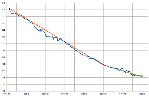 0
0 -
 0
0 -
This is my average graph. The average is the solid line, the real weight is dotted line. I weight everyday so the average is of the last five days. Clearly there is a down trend, regarless of a historic low.

My graph shows three stages: first between September and December, a fast loss from 228 to 202. Second, a month vacations with a modest gain, and third, a continuous yet slower loss from 206 to 188 lbs.
I could go faster? Probably. Does reaching my target a month or two sooner can change things? Probably not. I prefer a more comfortable weight loss path and stabilization.
The trend also shows that if the trend continues, I may be reaching my weight goal on mid october meaning 70+ lbs in 13 months with a month break. Not bad at all..
Something that I would have conidered two years ago as an impossible!0 -
Up! Let's see your graphs!0
-
a lot of nice graphs so far.
here's mine, but there's a lot the graph doesn't say so here it goes:
*1st 6-7 weeks i was using MFP setting to lose 2 lbs / week, then I was forced to up my cals based on "feeling famished", apparently that wasn't an issue when I had bigger reserves
*didnt have a food scale the first 4 weeks so either I was really under eating or underestimating
*last 3 weeks, I've been using my food scale less and less, needed a mental break
*exercise has been pretty consistent the entire time, ~1000 cals per week. going to up this for June
*lost most of my weight during first 14 weeks
*feels like I've been at the same weight for 5 weeks
All in all, I'm extremely happy with the results since I haven't taken out any particular foods. The two biggest changes I've made is not going for a second plate at dinner and not drinking so many calories (I don't mean alcohol). I love food and refuse to eat like a rabbit.
btw OP, I love your 3 milk flan pic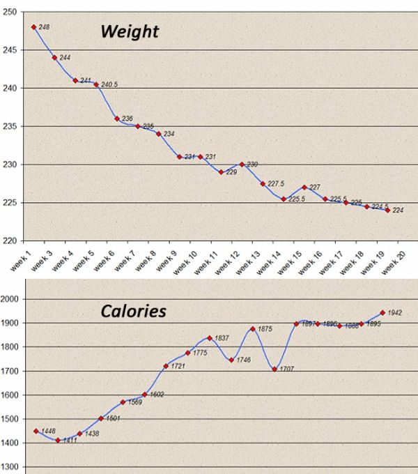 0
0 -
Here's mine from the last year. You can see in July where I quit using MFP, and then in August I got serious and haven't looked back. Also, I only log new losses, so you can see where I plateaued here and there before getting a new loss.0 -
This graph doesn't show my progress from the start (my heaviest was 168) but it's from close to when I started losing this time. You can see what 3 weeks of 'christmas' in January did to me haha.
 0
0 -
Never posted a photo on this site so hopefully it works
 0
0 -
Up!0
-
How does everyone get such cool graphs?! This is exactly what I am after. I go to 'reports' and choose the 'weight' report and get a very basic graph where its difficult to see the loss due to the large scale. How do I get these formats?!0
-
This content has been removed.
-
How does everyone get such cool graphs?! This is exactly what I am after. I go to 'reports' and choose the 'weight' report and get a very basic graph where its difficult to see the loss due to the large scale. How do I get these formats?!
most folks tend to keep an excel file with all their stats, then just generate a graph using charts within excel. The other cool graphs are from a phone app called libra weight manager0 -
Up!0
-
0
-

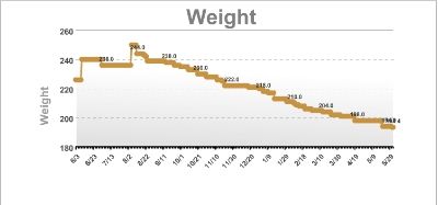
Edit to add, at first I was weighing weekly but around the beginning of June started weighing daily. That graph is more up-and-down: 0
0 -
I used to love looking at other people's graphs when I first started, so here is mine:
http://www.myfitnesspal.com/blog/RawCarrots/view/daily-weight-graph-update-now-with-a-plateau-568481
The blue line is my daily weight, the red is the trend line. I got a bit stuck the end of June/start of July, then second part of July was away on holidays, so logging was hard (but still ate as well as I could), used a different scale, it was hot and I was holding onto a lot of water... But as somebody posted in the comments section (and I had never realised it before looking at the graph!) I'm back on track where I would have been had I not had this "blip", so I must have been losing meanwhile, it was just masked by water fluctuations.
I record my weight daily in Libra, this graph is made in Excel as it looks nicer (exported the data) Had to resize the photo here, for a bigger version you can click on the blog link above.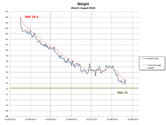 0
0 -
Idk how to do a screen shot, but I have lost more than 20 pounds within the last year or so.0
-
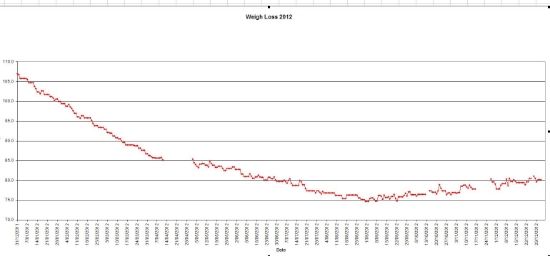
This is my 2012 graph. I hit goal in September and then started a bit of a bulk with heavy lifing and eating at surplus ..... now I am happy with my shape (mostly) and maintaining so havent graphed this year.0 -
Up!0
-

The dates got cut off, but this covers the last 90 days.0 -
I just posted some updated graphs in a blog post (pictures won't show here as too wide)
http://www.myfitnesspal.com/blog/RawCarrots/view/monthly-update-october-591971
It's a screenshot of Libra zoomed on Sep-Nov, Jun-Nov and from the start March-Nov. Plenty of bounces up and down :laugh:0


This discussion has been closed.
Categories
- All Categories
- 1.4M Health, Wellness and Goals
- 393.9K Introduce Yourself
- 43.9K Getting Started
- 260.3K Health and Weight Loss
- 176K Food and Nutrition
- 47.5K Recipes
- 232.6K Fitness and Exercise
- 429 Sleep, Mindfulness and Overall Wellness
- 6.5K Goal: Maintaining Weight
- 8.6K Goal: Gaining Weight and Body Building
- 153.1K Motivation and Support
- 8.1K Challenges
- 1.3K Debate Club
- 96.4K Chit-Chat
- 2.5K Fun and Games
- 3.8K MyFitnessPal Information
- 15 News and Announcements
- 1.2K Feature Suggestions and Ideas
- 2.6K MyFitnessPal Tech Support Questions