I'm a big nerd, and made a graph.

Rae6503
Posts: 6,294 Member
And I thought I'd share it with MFP for no particular reason....
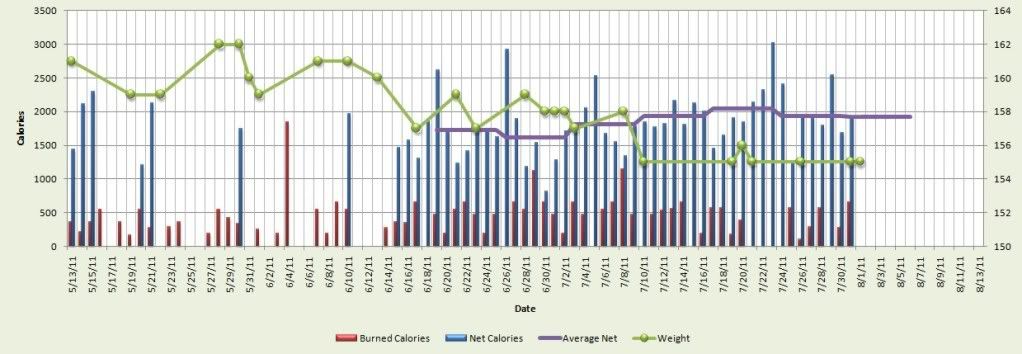
You can see that my weight loss a few weeks back seems to have little correlation with my average weekly net calorie intake. Interesting.
I repeat. I'm a big nerd. Thanks.
You can see that my weight loss a few weeks back seems to have little correlation with my average weekly net calorie intake. Interesting.
I repeat. I'm a big nerd. Thanks.
0
Replies
-
thats cool, ive been keeping a chart on my weight since 2009....... lol0
-
Is that on Excel?0
-
You aren't the only nerd, don't worry! I have done similar using excel and then I have even gone so far as to use forecasting models to see where I will be 1 month, 2 months, 3 months out based on the past 6 weeks trend of net calories. Just a little regression analysis and forecasting for ya! You may be a bigger nerd though just because you shared yours...haha j/k!! :happy:0
-
Nerds unite!
") 0
0 -
Is anyone willing to share their spreadsheet with me? This is impressive!0
-
Is that on Excel?
Yeah.0 -
Girls who make weight loss graphs are HAWT.0
-
That's awesome! And SUCH a good idea!0
-
Is anyone willing to share their spreadsheet with me? This is impressive!
Sure! PM me your email address.0 -
I've tried to do that, but can't figure out how to get the data out of MFP in a format that I can easily copy into Excel. How did you do it?0
-
As an accountant, one of the most frustrating things about losing weight is that, in the end, it's a mathmatical equation. Right? It's just that darn variable - metabolism - that is challenging to forecast/predict. Love that there are other "nerds" out there who think like me and use excel with their own journey!0
-
Awesome..You're the best! :flowerforyou: [
quote]Is anyone willing to share their spreadsheet with me? This is impressive!
Sure! PM me your email address.
[/quote]0 -
I'm a nerd too. I think your graph is terrific. Have graphed your weight loss and then added a trend line through it?0
-
I'm with ya on the graphing. :bigsmile:
I've a spreadsheet (with graphs) at home that I use to track calories burned, calories eaten, percentages of macros (daily & weekly), sugar, fiber, sodium, potassium, sodium/potassium ratios, sleep, energy levels, weight loss, weight loss vs. calculated loss, body fat % loss, and lean body mass.0 -
I have one too. Ok, I have a graph for every month, plus one for the entire ytd. :laugh:
I also have an analysis of where my deficit MUST be based on my weight loss (to try to figure out how far off my calories are).
Love my graphs!0 -
I've tried to do that, but can't figure out how to get the data out of MFP in a format that I can easily copy into Excel. How did you do it?
I've just been entering my totals in excel by hand. I started tracking using DailyPlate and it annoyed me to lose everything when I switched so I made the excel spreadsheet. Plus I don't like MFP's plots as much as DailyPlates so I made my own.0 -
Girls who make weight loss graphs are HAWT.
Agreed but HAWTer when they graph lifting statistics 0 -
I like it, I made one too.0
-
Hmmm...this nerd may have to do that too. The MFP report output leaves me wanting more options. Thanks!0
-
Rach, it's data mining at it's finest, you need to expand the data to a larger sample size and I'll bet you see more correlations. One month is a pretty small sample size for this kind of thing, trend analysis should take into account 2 or 3 months at a minimum. But it's a very cool graph, what'd you use? Pivot tables? I could get you some even better stuff if you let me throw it into a sql server OLAP cube, could get some very cool numbers in that situation. You think YOU'RE a nerd? I've been a SQL dba for the last 12 years, that's the nerd that nerds think are dorky.0
-
Ain't nothing wrong with bein' a nerd. I've made charts and graphs for my own personal amusement before.0
-
That's a great graph! I wish I had that kind of patience. :laugh: If I could just stay focu
ooooh, shiny.0 -
I have weights graphed all the way back to 7/1/10 but not calories. I haven't been consistent on counting. It would be a cooler graph if I could document my entire weight loss journey...0
-
Apparently everyone wants to be nerdy! I've gotten some requests of the spreadsheet. So if anyone else wants it, PM me your address. I'll send it, and hopefully some instructions. Minimal excel skills are required...
 0
0 -
Yep, another accountant here. I love my excel and I have my spreadsheet too with 4 tabs. What I hate about MFP is when you update your calories today fo ryour new weight it goes back to the past and changes what your goal was. That is why I need the spreadsheet. Plus I calculate my average calories per day for the last weeks to figure my average daily burned calories. (I add back the calorie deficit based on my actual weight lost.) We need a dork group I think.As an accountant, one of the most frustrating things about losing weight is that, in the end, it's a mathmatical equation. Right? It's just that darn variable - metabolism - that is challenging to forecast/predict. Love that there are other "nerds" out there who think like me and use excel with their own journey!0 -
I love it - I am an excel geek too!0
-
Do you have SPSS? It is really hard to tell correlation without it. If you send me the spreadsheet I could actually do the correlational analysis...I may of just out-nerded you. Message me if you want I will give you my e-mail.0
-
Hey, another nerd (CPA) here. But I just work with MFP and don't chart it on Excel, but maybe I should start since my weight reduction from six months ago to now has resulted in an IMMATERIAL DIFFERENCE!!!0
-
bump0
-
this is awesomely nerdy
 0
0


This discussion has been closed.
Categories
- All Categories
- 1.4M Health, Wellness and Goals
- 398.1K Introduce Yourself
- 44.7K Getting Started
- 261K Health and Weight Loss
- 176.4K Food and Nutrition
- 47.7K Recipes
- 233K Fitness and Exercise
- 462 Sleep, Mindfulness and Overall Wellness
- 6.5K Goal: Maintaining Weight
- 8.7K Goal: Gaining Weight and Body Building
- 153.5K Motivation and Support
- 8.4K Challenges
- 1.4K Debate Club
- 96.5K Chit-Chat
- 2.6K Fun and Games
- 4.8K MyFitnessPal Information
- 12 News and Announcements
- 21 MyFitnessPal Academy
- 1.5K Feature Suggestions and Ideas
- 3.2K MyFitnessPal Tech Support Questions