New Web Food Diary WITHOUT PIE GRAPH and WITHOUT PERCENTAGES???

Are you serious??? You threw out the PIE GRAPH with PERCENTAGES??? And NOW you want us TO PAY to see the percentages of our MACROS in the New Web Food Diary??? Shame on YOU!!! I predict you will loose literally ALL of your subscribers because of this greedy pathetic sneaky move you made. Also, what's the logic of putting the total calories and now stupid and useless macros line ON TOP of the diary??? As you calculate something, the final result is always at the bottom BUT only the GENIUSES who work at YOUR FITNESS PAL think that it is smart to put the SUM OF ALL CALORIES or MACROS - AT THE VERY TOP of the page??? You must be proud of yourselves, right?
Replies
-
Agree - new format is utter pants.
1 -
Thank you.
1 -
Meh! Pie graphs are high in calories! lol
0 -
It doesn't bother me. A pie chart is worthless to me. I just look at grams of protein and total calories. I see on the new format you can roughly estimate the macros by looking at the colors beside the macro totals.
I did notice the grams totals differ from the old format. When you add a meal to the diary in either format, each item in the meal has its grams amount rounded. Whether that's up or down or nearest rounding in the old and new format, I don't know. I see in the old format the meal total simply sums the rounded items, which is definitely inaccurate. In the new format, it probably sums the actual grams of each meal item.
e.g. if you have 3 meal items each 5.6g protein, the old format probably shows the total as 18g, while the new format probably shows 17g.
The formatting could be better. Indent the meals, and have the meal names in a different color or style to the meal entries. It all sort of blends together as is.
0 -
My only two real problems are I prefer the section totals at the bottom of each section and I don't like the white of the diary background instead of it being shaded.
I don't use the app. I access mfp via the website.
0 -
The pie chart is important to those of us who work our macros based on a % split, as is common in sports nutrition - I don't want logging to be an exercise in mental arithmetic or guesswork. The pie chart is hugely useful as a quick visual check to see if what I'm eating fits my target split.
1 -
The OP is phrased as if talking to MFP, or at least to its staff.
Its staff don't generally read posts in this part of the Community: This - and most areas of the Community - are intended for communication amongst regular users, people with zero power over the software other than by communicating with MFP or its staff . . . which isn't happening when a person posts here.
There are two parts of the Community that the staff usually reads and often responds to. That's Feature Suggestions and Ideas, and MyFitnessPal Tech Support Questions.
There's an actual thread over there, created by the MFP staff, asking for feedback on the new diary format.
Maybe that would be a good place to post about this? The only point of posting here is to vent or whip up other users (but if the whipped-up users only comment here, it still accomplishes nothing productive).
2 -
The line graph tells you the same info as the pie graph, maybe a bit better. Remember when you were in school and learning about graphs? Basic graphs all work the same way, I don't use the pie graph but to me the bar graph is easier to read and easier to estimate percebtages if that is important to you. AND it takes up less space. If you don't like it respond to the link and say why. It is basically the same idea as the bar graphs in the weekly report
2 -
I was going to say that sometimes you just need to vent but, of course, you covered that :)
0 -
I actually already sent a feedback to where the @AnnPT77 suggested.
I have to say that it is stunning how many people here are using MFP without realizing how important is that GRAPH WITH PERCENTAGES.
I see that @Cant_think_of_a_username clearly understands what I am talking about. But so many others don't.
And NO, @pony4us, the line graph DOES NOT tells us 'the same info as the pie graph, maybe a bit better'. With that statement you literally showed everyone here how clueless you are about what you are doing here at MFP. You cannot ESTIMATE percentages from new LINE GRAPH because you obviously have no clue how percentages are calculated or even what percentages represent. So, to enlighten you… those percentages in the PIE GRAPH are showing us where the calories we are consuming are coming from. And that is superimportant because even if you eat recommended 2,000 calories per day you still need to watch out those percentages and keep them in balance. It is generally considered that 50% of calories should come from carbs, 30% from fats and 20% from proteins. That's how you stay healthy. If you are not in balance and you consume calories that are coming let's say 50% out of fats - you will likely have cholesterol, and of course big fat unhealthy belly. And it is so easy to overconsume fats because they are in almost every product we consume: milk, yoghurt, meats, chocolates, cookies, cakes, canned food, even some fruits and vegetables, etc. But you can not estimate that just by looking at the new version of line graph, as you claim, because the new version of graph doesn't show percentages but only MACROS IN GRAMS. And each gram of carb has 4 calories, each gram of fat has 9 calories and each gram of protein has 4 calories again. By looking at the new line graph there is absolutely no way that you can ESTIMATE anything. Instead you really need to calculate that. Multiply fats by 9 and divide by total calories, multiply carbs by 4 and divide by total calories, and multiply proteins by 4 and divide by total calories. Then you will get percentages. And together they should be 100%. So, clearly there is no way to estimate that, unless you are Sheldon Cooper. The other option is to ask AI a question, for example: 'My macros for today are 223 g of carbs, 89 g of fat and 112 g of proteins, what are my total calorie percentages?'. Then you will get a calculation with explanation. I can see that, what I just mentioned here was clearly completely unknown to you until now. Oh, and don't mention a school to me. I am doing my PhD now, so it has been quite a while since I learned to read all kind of graphs, unlike you. You better go check your bloodwork and it will tell you that you have no clue what you are putting into your body or doing here at MFP, probably for years. Capisci?
1 -
Retired math uni prof here, also mid 70s weight steady for 9 years and never been on any meds. Yep…I don't know a thing.
1 -
Percent is common in sports nutrition? That's not been my experience during coaching education or the practices of coaches I've worked with myself. Even now, as a recreational athlete - well, maybe especially now as a recreational athlete - it makes a lot more sense to estimate essential nutrient needs as absolute gram minimums, rather than percentage of calories. Some trainers maybe look at it as percents, dunno. It's simpler, sure.
IME, percentages are more of a general-audiences simplification. Actual sports differ greatly in their calorie expenditure and somewhat in their nutritional demands, besides. Planning macros in grams handles that better than planning macros in percents, though percents may be viable in a cohort of athletes all doing the same sport, training at similar intensity, duration, frequency and with similar modalities. In that case, any significant nutritional-needs variability between athletes who have differing calorie needs may tend to be proportional to their personal calorie expenditure.
Athletes of similar size in diverse sports will typically require somewhat similar absolute gram amounts of protein and fats - though that can differ somewhat between sports. But the calorie needs of a long-endurance athlete can differ wildly from those of (say) a strength athlete. The training load, in calorie terms, varies quite a lot.
I've known some collegiate athletes in my sport to need supplemental feeding of around 4000 calories daily on top of their regular meals/snacks. Even at 20% protein, which might be a low number in percentage splits terms for athletes, they certainly don't require 200g more protein on top of the protein they're already getting from regular meals. (These would be women 18-22, usually in the 5'10'-6'2" height range, maybe weighing 160-175 pounds +/-. 200g protein total should be very ample for most.) Even I don't need lots more protein than my standard gram minimum if I go off to a workshop/camp and burn hundreds more calories daily than my usual routine.
Grams estimates IMO and IME are more nuanced and effective in planning athlete nutrition . . . and more nutritionally ideal even in everyday people with varying calorie needs. It's more that a lot of people don't want to delve into that level of detail, being more interested in adequacy than optimality. Percentages aren't terrible, in that sense. It keeps things simple, works well enough.
1 -
Ten years here on MFP; 50 pound weight loss (maintained for 9+ years so far); very attuned to getting good nutrition (macros/micros/fiber/specific fat subtypes/essential amino acid balance/probiotics/prebiotics/etc.); care about my athletic performance (very good for my age/issues); care about my health markers (currently very good, especially for my age); and more.
I have literally never paid a moment's attention to that pie chart in the ten years I've been here. Well, maybe once or twice when some user asked a question about it - I do understand and can explain it.
I'm not saying it has no value for anyone. I'm not saying you shouldn't want it. I'm not arguing against bringing it back.
But that pie graph with percentages isn't universally important or even useful, as you seem to imply.
"It is generally considered that 50% of calories should come from carbs, 30% from fats and 20% from proteins. That's how you stay healthy."
Yes, those percentages are a common generic prescriptive. But it's not "how you stay healthy", or at least not the only way. For example, I have a daily gram minimum for protein and fats, since each of those contain essential nutrients, essential amino acids (EAAs) and essential fatty acids (EFAs). I don't mind if I exceed those gram minimums, within reason.
Carbs aren't essential in a similar way way, so I just use those to balance calories, pretty much. On any given day, the percent of my calories from each macro will differ, and that's totally fine. If I have a great workout day and my actual TDEE that day is 3000 calories, I don't suddenly need 100g of fats that day instead of 50.
On top of that, someone on way too low calories isn't going to get adequate amounts of protein/fats using that generic prescriptive. There's no way to get adequate minimums of certain nutrients on too-few calories. The percents aren't gospel or a guarantee. If I'm lying in bed all day burning fewer calories than usual and eating less, I still strive to get my gram minimums.
Sure, percents are a fine, straightforward way for many people - maybe most people - to look at nutrition. But IMO you're overstating the importance of that graph if you're suggesting that adherence to percents is universally "how you stay healthy". There are various ways to do it.
3 -
University math professor and you didn't realize the difference between those very different graphs? Wow, just wow!
1 -
I never said I strictly pay attention to have 50-30-20 percentages on a daily basis, because I am not a professional athlete, but I strive to get close numbers to those and pay attention that my calorie intake is in balance for most of the days. If you are taking 2,000 calories per day (or 3,000 calories per day, if you are active in some sport) it is not the same if majority of those calories come from fats instead from carbs. Keping such a diet (with higher fat intake) for long term will put anyone in trouble after some time, even if they consume those recommended 2,000 calories in total per day. That's what most of the people don't understand and think that if they only consume 2,000 calories per day, they are fine and they will keep steady weight. Yes, thier weight might stay the same but their bloodwork will suffer badly. That's why that pie graph with percentages is really important.
0 -
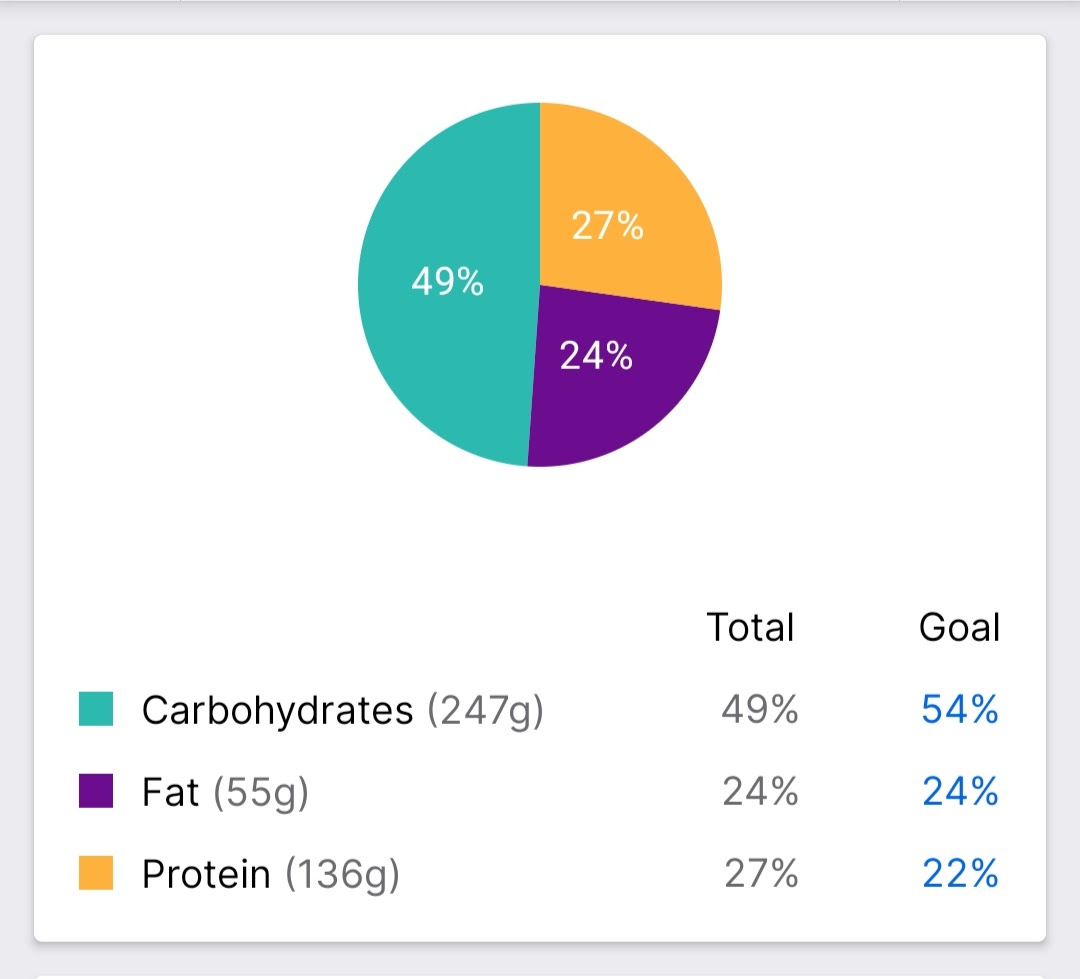
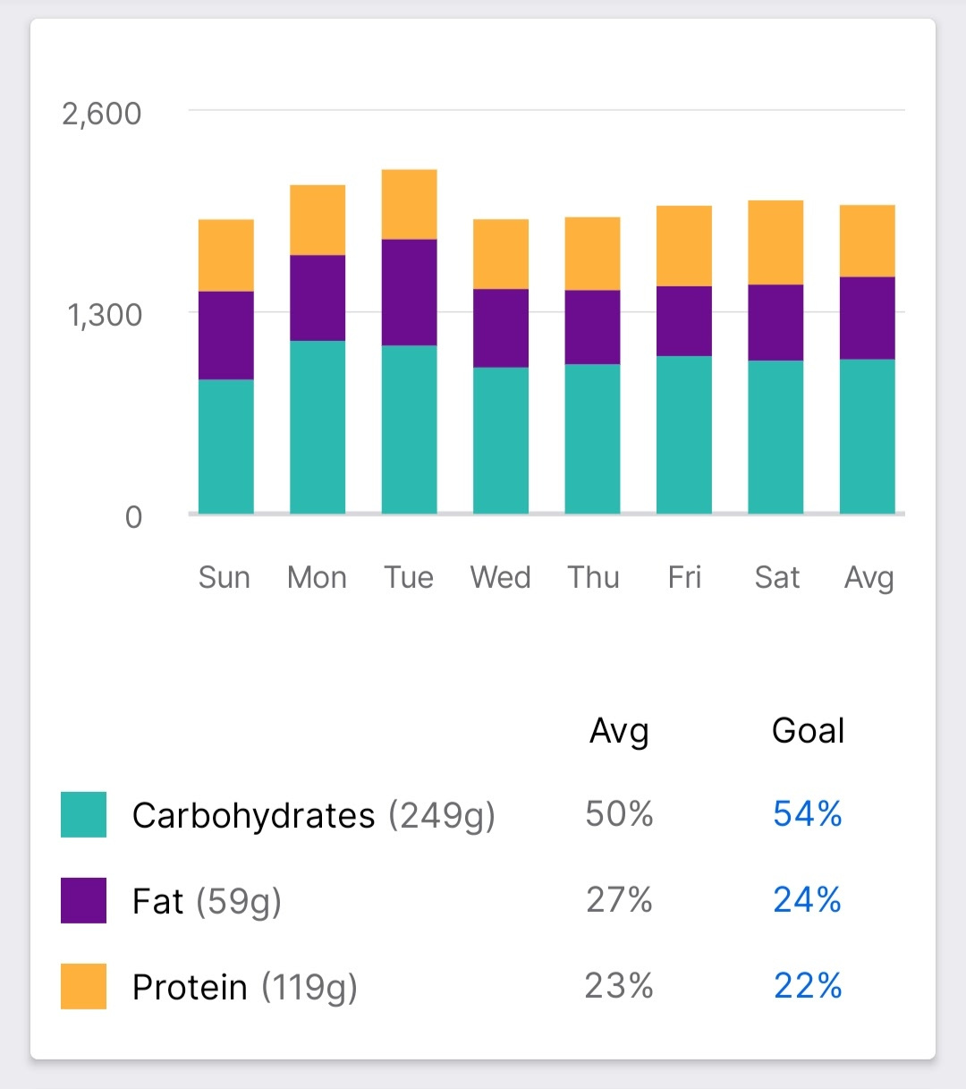
I'm assuming you're primarily or exclusively using web browser MFP? If it would be viable for you to get the phone/tablet app (free for Apple or Android, AFAIK), IME that has more robust features for reporting on nutrition . . . even without premium MFP, though premium adds a lot of depth to it.
If I'm understanding what you want from the pie chart, that's available in the Nutrition section of the app, either on a daily basis, which looks like this:
. . . or as a weekly view average, which looks like this:
I think we're not communicating here, but I'm pretty sure we disagree about optimizing nutrition. That's OK: Different people like to look at it in different ways.
In my view, fat intake isn't the devil. The types of fat eaten matter, too. Even the food choices can matter - the foods the fats inherently occur in that may make up our overall diet.
If we're talking about atherosclerosis or visceral fat, both of which of course can be bad, more than percent fat intake is relevant. For sure, there are more relevant factors than simply fat intake when it comes to bloodwork more generally.
P.S. I don't eat a high fat diet. In reality, looking backward, I eat semi-close to the generic percentages most of the time, as you may've noticed in the screen grabs above . . . I just don't manage my eating based on those percentages.
1 -
Yes, exceedingly common in fields such as bodybuilding, cycling, ultra distance sports.
0 -
I've not updated the app in ages on my phone, and it still functions as I'm used to. I do log my food on the phone, especially when I cook, but then sort out serving and the likes on the web. Here's a comparison between old and new. Note: currently on vacation and have not really logged anything since.
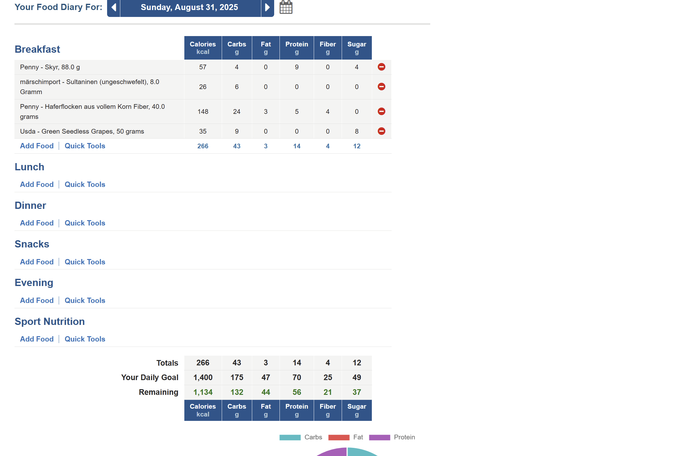
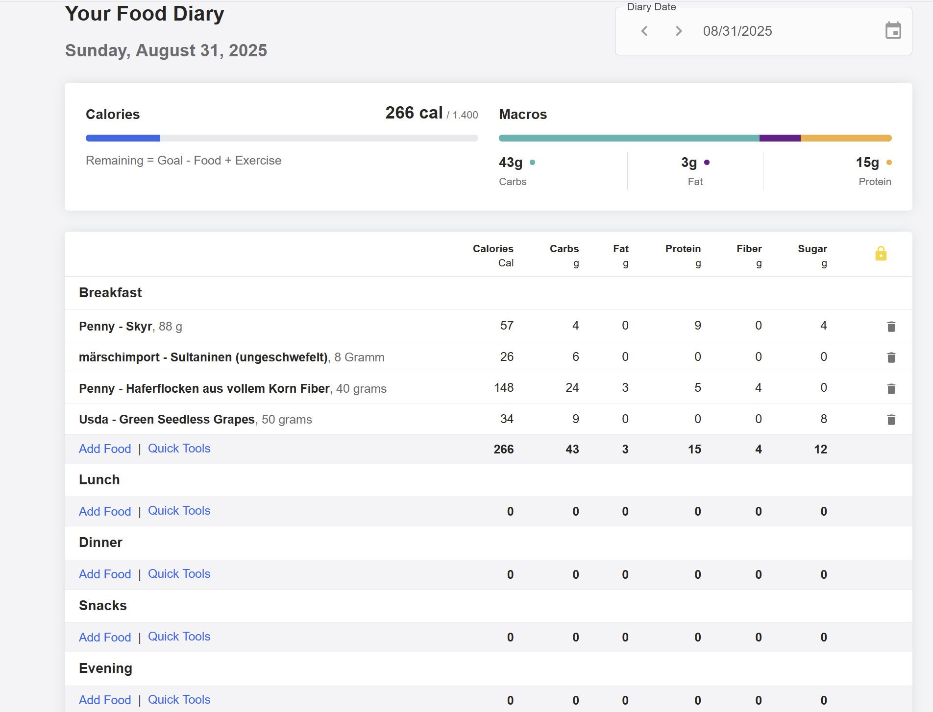
The bar itself is fine, considering I didn't have percentages in the pie-chart anyway. But
* the bar is set on a 1/3 split, which I guess most people don't use. It's just bad design.
* so much white space. It's designed like an app and i get a lot less information one one computer screen.
* The grams at the bottom being premium is just silly.
The biggest annoyance for me is how much space this all takes up. I have a small laptop and not a huge monitor. And that means a massive amount of scrolling will be involved.
Oh, and they still haven't fixed the decimal problem. If I have 40g of oats one day, and the next I adjust it to 46g then I have to delete the decimals of 40.000000000234231 -
@yirara you have percentages on old PIE graph when you hover your mouse over the graph itself. Also, you have a percantages on your smartphone when you press on the PIE graph itself. You have NO percentages on NEW line graph, just macros in grams which you already have in your table so line graph is completely useless as it deosn't show percentages anymore.
It's a good point with space that new format takes and lots of scrolling.
Yes, decimal problem is still here.
0 -
I like the new Macro split. It works better for me to see what my totals are looking like. Percentages do nothing. I need to see how many grams I am getting of each. This little line graph makes it easier to see as a very visual person. It's now in your face instead of just listed at the bottom.
I do agree I hate how much white space there is on it though.
0


Categories
- All Categories
- 1.4M Health, Wellness and Goals
- 398.1K Introduce Yourself
- 44.7K Getting Started
- 261K Health and Weight Loss
- 176.4K Food and Nutrition
- 47.7K Recipes
- 233K Fitness and Exercise
- 462 Sleep, Mindfulness and Overall Wellness
- 6.5K Goal: Maintaining Weight
- 8.7K Goal: Gaining Weight and Body Building
- 153.5K Motivation and Support
- 8.4K Challenges
- 1.4K Debate Club
- 96.5K Chit-Chat
- 2.6K Fun and Games
- 4.8K MyFitnessPal Information
- 12 News and Announcements
- 21 MyFitnessPal Academy
- 1.5K Feature Suggestions and Ideas
- 3.2K MyFitnessPal Tech Support Questions