FDA redesigns nutrition panel

jonnythan
Posts: 10,161 Member
Great changes. Much more readable and calorie content as well as servings per container are now featured much more prominently.
EDIT: Potassium content is now mandatory!! This is probably more significant than the panel redesign.
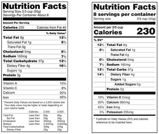
EDIT: Potassium content is now mandatory!! This is probably more significant than the panel redesign.

0
Replies
-
I like the changes! It's nice that they have actual amounts for the Vitamin D, etc.
ETA: they did add potassium, too.0 -
UGH. THE ALIGNMENT.
 0
0 -
US nutrition panels always seem so much more simplistic than UK ones to me.0
-
What's wrong with the alignment?0
-
Great changes. Much more readable and calorie content as well as servings per container are now featured much more prominently. Still doesn't include potassium, sadly.

New style is on the right? It shows potassium...0 -
What's wrong with the alignment?
IT'S ALL JUST LEFT. 0
0 -
I approve this change.0
-
Looks ok.
I could go with either0 -
What's wrong with the alignment?
IT'S ALL JUST LEFT.
The percentages are right-aligned 0
0 -
We could make a game out of guessing what the item is. My guess is some kind of cereal.0
-
Great changes. Much more readable and calorie content as well as servings per container are now featured much more prominently. Still doesn't include potassium, sadly.

New style is on the right? It shows potassium...
Oh look at that, it does. Huh.
"Lastly, the labels would make Vitamin D and Potassium counts mandatory, while Vitamins A and C would be optional."
YAY!!0 -
What's wrong with the alignment?
IT'S ALL JUST LEFT.
The percentages are right-aligned
 0
0 -
Great changes. Much more readable and calorie content as well as servings per container are now featured much more prominently. Still doesn't include potassium, sadly.

New style is on the right? It shows potassium...
Oh look at that, it does. Huh.
"Lastly, the labels would make Vitamin D and Potassium counts mandatory, while Vitamins A and C would be optional."
YAY!!
Okay, that does make me happy... hopefully MFP can make Vitamin D a trackable micro now, too!0 -
i like it cause it does better display the information, but i can't help but think the old one was more professional, while the new one looks like it was designed by a 3 year old. can't quite pick out why i see that.0
-
Might make the importance of CALORIES and SERVING SIZE more easily understandable for some.
 0
0 -
Sad that we have to put the calorie count in 70 pt font because people can't be bothered to read it, but whatever works I guess! I'm sure I'll get used to the new one.0
-
i like it cause it does better display the information, but i can't help but think the old one was more professional, while the new one looks like it was designed by a 3 year old. can't quite pick out why i see that.
I feel the same way. I dont know why I get an amateurish feel from the re-design...0 -
I'm happy they took out the "calories from fat" that was useless information!0
-
"The FDA is also proposing changes to serving size requirements in an effort to more accurately reflect what people usually eat or drink. For example, if you buy a 20-ounce soda, you're probably not going to stop drinking at the 8-ounce mark. The new rules would require that entire soda bottle to be one serving size -- making calorie counting simpler."
source: http://www.cnn.com/2014/02/27/health/nutrition-labels-changes/
YESSS0 -
We need this in the UK0
-
Any idea when this is supposed to start?
I like it, especially the potassium info. Hooray for changes!0 -
Pros: Tries to make it more obvious that the information is for A SERVING and not the whole damned container. Includes Vitamin D and potassium. Finally stops bothering people with the "Calories from fat" nonsense.
Cons: The percentages on the left make me twitchy. Protein is not at the top where it belongs.0 -
I approve this change. I like it.0
-
Well alright then. Glad after 20 years with the old design they decide to shake things up a bit.
Based on cnn it's supposed to emphasize calories with serving size as well as sugar intake.
Edit: I looked at the new label again...:embarassed:0 -
Pros: Tries to make it more obvious that the information is for A SERVING and not the whole damned container. Includes Vitamin D and potassium. Finally stops bothering people with the "Calories from fat" nonsense.
Cons: The percentages on the left make me twitchy. Protein is not at the top where it belongs.
Agreed.
Calories at the very top
Protein to follow
Fat to follow0 -
i like it cause it does better display the information, but i can't help but think the old one was more professional, while the new one looks like it was designed by a 3 year old. can't quite pick out why i see that.
I was thinking the same thing. The information is more prominant but looks a little elementary. :huh:0 -
Well alright then. Glad after 20 years with the old design they decide to shake things up a bit.
Based on cnn it's supposed to emphasize calories with serving size as well as sugar intake. I mean I get the calories, but I don't see anything special about the sugar
well sugar is the devil of course...
PROCESSED sugar that is, because you know, that is completely different from natural sugar.0 -
i like it cause it does better display the information, but i can't help but think the old one was more professional, while the new one looks like it was designed by a 3 year old. can't quite pick out why i see that.
I was thinking the same thing. The information is more prominant but looks a little elementary. :huh:
all they need to do is change it to Comic Sans font and you're good to go!0 -
Yes! I am definitely happiest about the requirement for potassium. :drinker:0
-
It'll take a little getting used to, but I don't hate it!0
This discussion has been closed.
Categories
- All Categories
- 1.4M Health, Wellness and Goals
- 397.1K Introduce Yourself
- 44.2K Getting Started
- 260.9K Health and Weight Loss
- 176.3K Food and Nutrition
- 47.6K Recipes
- 232.8K Fitness and Exercise
- 457 Sleep, Mindfulness and Overall Wellness
- 6.5K Goal: Maintaining Weight
- 8.7K Goal: Gaining Weight and Body Building
- 153.4K Motivation and Support
- 8.3K Challenges
- 1.3K Debate Club
- 96.5K Chit-Chat
- 2.6K Fun and Games
- 4.6K MyFitnessPal Information
- 16 News and Announcements
- 18 MyFitnessPal Academy
- 1.4K Feature Suggestions and Ideas
- 3.1K MyFitnessPal Tech Support Questions


