Food Diary

I do not like the food diary format that you just changed to.
Replies
-
Thanks for your feedback. Could you be more specific about what you don't like?
0 -
Pretty awful design.
Too much white space wastes page space. That causes a lot of needless scrolling.
For most people totals are at the bottom of the list not the top.
Does anyone in the design group know anything about human factors? That is the science of designing things so it is easy for humans to use. I don't see that here.
31 -
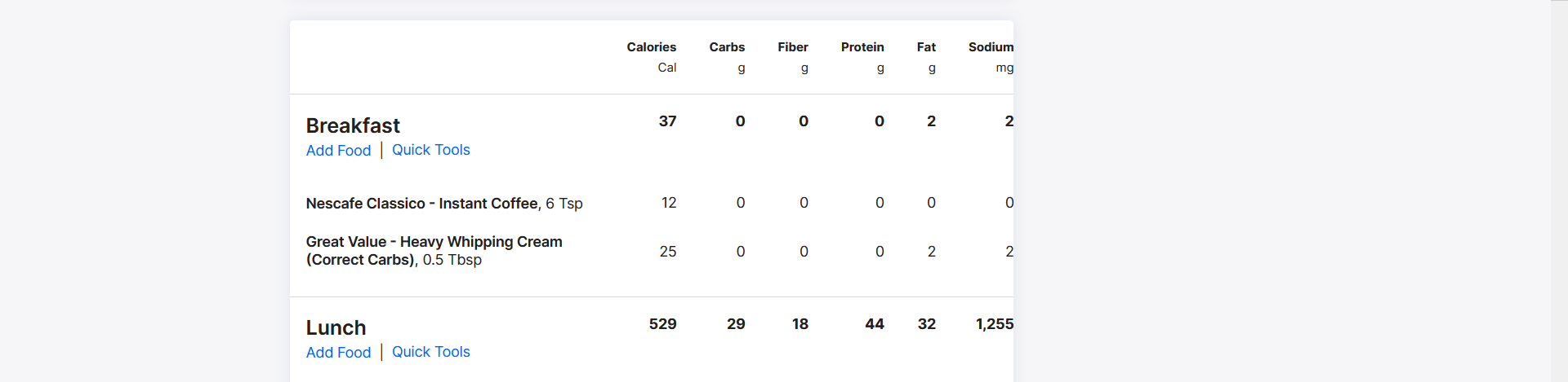
The new UI for the Website is overly bloated and takes up so much space now. It takes twice as long to scroll through the diary than it originally did and it's hard to read with the larger text with wrapping formats.
The items in each section are no longer visually separated either, so viewing multiple food items in "Breakfast" or "Lunch" makes it feel muddled and contributes to straining the eyes.
There's something about the font that also feels like it's harder to read than originally. It's a huge relief that the Add Food pages look normal (currently) as it's much easier to read and see.
When viewing today's diary and you want to Quick Tools to Copy Yesterday or Copy from Date, the site no longer auto-refreshes the page, and instead gives you a popup saying "Meal Copied" without any additional visuals or actions. You now have to manually refresh the page for the food items to show up so you can see what you've added. The previous version auto refreshed the page and showed you what you just copied to your day.
I can see the new UI working if you're browsing previous or future days and you want to copy a meal to another day without losing your spot, but when you're copying meals looking at an empty diary and it doesn't refresh the page for you, that's more work on the user to take another step to remember to refresh and continue their entry work. Causing more steps and more clicks for the same actions is always a hinderance in my view for UX.
There's also a bug for the website, it doesn't show the Trash Can icons and it falls short on the webpage for the Diary, so I can't delete entries. This seems to be because of aspect ratio of the website. Changing the window size to a more "mobile" view of the tab fixes it. Seems like the new UI is geared more towards mobile users instead of desktop/website users.
 31
31 -
I don't like it either.
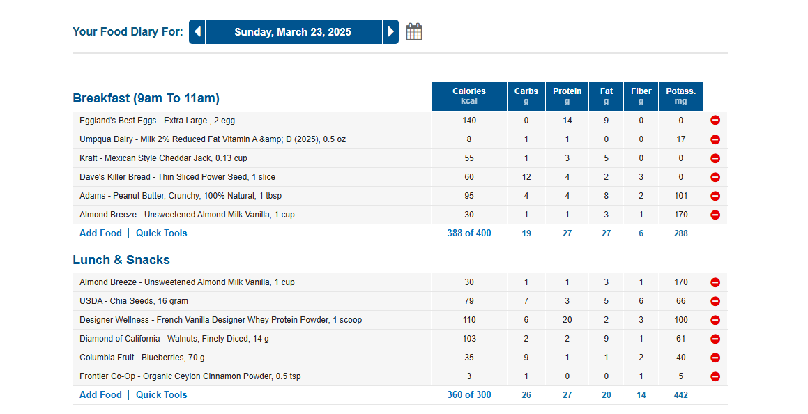
I used to get most of my food descriptions in one line so I could see all my day's entries on one page and I could still see the headings for food categories (carbs, fats, protein, fibre, sugar) at the top at the same time as the totals at the bottom of the page. Once I hit lunchtime I can no longer see either the top heading or the repeated headings below the totals. If I want to change my food choices so I better meet my carbs, fats, proteins, etc., I have scroll up and down trying to work out what are my best change/swap options.
What's the rationale behind it? I can's see any benefit at all? Why did it change?
And so many ads to persuade us to sign up for premium. Definitely not if this is the new format you're going with.
30 -
The new format is incredibly difficult to read at a glance, it comes off as a visual mess of words and numbers like a wall of text.
There is nothing graphically set up as a visual break for your eyes so it takes more time to see what you've just entered, where you just entered something, and what info you have logged overall. Very difficult to read quickly.
Very much not happy with the new visual change.
31 -
Submitted a support email as well, but there is far too much unused space on web view and, like Ashagi7 wrote above, without lines to breakup the space, following what has been added to meals in the diary is very visually busy. A reversion or a toggle in settings would be much appreciated.
17 -
@Ashagi7 said it quite clearly in the post above.
The old format was perfect. It was very easy to read. Unfortunately, I can't go back to see the old format. Let me say that I was shocked when I saw the new format. The new format is almost unusable for me. Please bring back the old format!
33 -
I agree with the above. The right side of the screen cuts off and you can't even see the full diary. It's very clunky. I also do not have a visible option to delete entries.
18 -
The Food Diary on the website was not broke, but you fixed it. Horrible. It is nowhere near ergonomic, some of the values don't change unless you refresh the page. Don't know why it has been changed. Yesterday's version, which has been there for quite some time, was seasoned, effective and efficient. Please change it back or allow the option to use that style. My lands. Who dreamt up this horrid template?
25 -
The ability to update my hydration was much easier before. I could visually see the glass & oz easily. Now, all I see is a number. The units don't seem customizable, which they were before. Additionally, I support all the other comments. The new layout doesn't seem user/reader friendly at all. imho. It just seems like a change to make a change, not driven by a customer need.
22 -
I've literally never participated in this forum until today bc everything was just right.
Why did they change the web ui?!!
Hate it, change it back asap please!
The ui is the same as the app version now which is why I dont use that version....
27 -
Hello! I agree with most of these other comments. The previous format was great! I could see everything I needed in one glance. Macros were in neat columns and it was easy to see at a glance which foods contributed to which nutrients. I'm only really interested in protein, and now I can't see that anymore.
Please change it back to how it was before.
Thanks for reading!
21 -
Same here! (on all counts!)
14 -
I agree with the many others who are saying the new format is not good. I do not like that my calorie totals for each meal appear at the TOP of the list. That feels backwards. All blue bars to help see the various sections are gone, and nothing but a wall of white. Graphically so unappealing and unusable. Very sad because I really liked this app!
19 -
terrible.
every company always feels the need to change up their design for no reason and most of the time - they make it worst.
i'm sure the data metrics say majority of users are mobile but must they force the same unnecessary padded, wasted white space, mobile-interface for everybody?
there's zero reason to make the web UI look like that when you have many users accessing from desktops, laptops, et cetera.
so many websites over the years turn to this mobile-esque UI design to drive user traffic into their dedicate apps and to feed more adverts and it's tiring.
16 -
FOOD DIARY
The change is ridiculous. Read all the previous comments. I agree. I hope you did not pay too much to that "consultant." Please change it back to how it was before.
20 -
@kingscounty I also use the web version on my desktop. I do little on my phone except make phone calls, get email and text notifications, and occasionally sent a short text.
It seems like all these companies are trying to force us to use their mobile apps. I have some vision problems, so I can see better on my desktop. And, it is so much easier to type on a real keyboard. We're not all in our 20's!
17 -
The change in the Food Diary is horrible now. It's really bad on the eyes and is making me consider going to another site that I can actually see things on if this doesn't go back to what it was previously.
16 -
I actually found some screenshots of the prior format. This is what it used to look like:
This is what it looks like now (starting today):
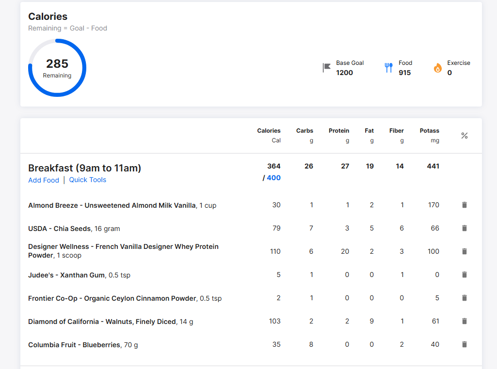
The old format was definitely better. I agree with @Vyvy_Kalier If it doesn't change back, I may have to look elsewhere. The new version is totally unusable.
31 -
So much bloat and white space. Not being hyperbolic here, I refreshed the page the first time I saw it because I thought some formatting just loaded wrong.
Not having clearly delineated lines in a table is probably the most baffling part of this to me.
I know people always complain when there is change, it's how these things go. But this genuinely seems like a misstep to me. From feedback here and on the MFP reddit, it seems like I'm not alone in that. I'm hoping you guys act on it.
Can I ask what the goal here was? Was it just a change because you hadn't in a bit? Is is supposed to look/feel more modern?
23 -
Soooooooo BAD UI.
Don't like it. Worst interface ever !
20 -
amazing incredible wow. Never seen such a horrific update to a primary feature. 🤬 I don’t think the programmers making the changes use the site. 😖 💯 agree with previous detailed comments but not holding my breath anyone will fix it. Wasnt broke. Now it is. Great job 😒
Also if we good have the ability to spoiler photos again. That would be awesome 😉
11 -
I don't like it either. I refreshed because I thought something went wrong, and then I had to check to make sure I wasn't somehow on a mobile site on my computer. As others have said, there is so much unused whitespace, where the old version was more compact. The delineation between foods and meals was much clearer. My recently used customized water entries are gone for quick adding. I don't see any benefit to the change. Even just general aesthetics, it feels very "fisher price".
18 -
Not the OP, but it's AWFUL. It takes up SO much screen real estate that it affects the usability of it. I don't usually care about UI changes when it affects how it looks, but this is simply less useful to me.
13 -
Have you deleted all of the saved NOTES that from the Diary Page? When I scroll back to prior days, the NOTES section is blank? I've have daily NOTES going back many years. Please restore them. Thank you.
13 -
I cannot enter half cups of water, only whole cups. I don't like it. Also, as others have states above, the new font and format are more difficult to read.
10 -
I agree 100% with the comments here. I would add I'm a relatively new user of MyFitnessPal (about a year now), and came here from Lose It, which had made design changes and announced they were no longer supporting their web site. I am sure many others of us came here from other sites, and MyFitnessPal should not take its users for granted.
12 -
I don't like it either. I mainly use MFP on desktop and with this new redesign, all of the white empty space means I have to scroll for too long to view my food diary. With the old design, it was compact enough that I could view all of it at once, which was much more convenient (and it looked better, too).
12 -
Looking for a new site… Cronometer has more things tracked (but at the bottom of the page). After nearly 4 years of daily tracking on MFP, I've turned off the auto-renew of Premium and am ready to bail.
Fixing something that isn't broken seldom is a wise idea.13 -
Also posting for the first time ever about the UI. I too, thought it just wasn't loading properly with the lack of lines and so much white space.
It's bad, and is completely turning me off wanting to use this app. It wasn't broke, so why on earth did you "fix" it.13


Categories
- All Categories
- 1.4M Health, Wellness and Goals
- 396.6K Introduce Yourself
- 44.2K Getting Started
- 260.8K Health and Weight Loss
- 176.3K Food and Nutrition
- 47.6K Recipes
- 232.8K Fitness and Exercise
- 449 Sleep, Mindfulness and Overall Wellness
- 6.5K Goal: Maintaining Weight
- 8.7K Goal: Gaining Weight and Body Building
- 153.3K Motivation and Support
- 8.3K Challenges
- 1.3K Debate Club
- 96.5K Chit-Chat
- 2.6K Fun and Games
- 4.5K MyFitnessPal Information
- 16 News and Announcements
- 18 MyFitnessPal Academy
- 1.4K Feature Suggestions and Ideas
- 3K MyFitnessPal Tech Support Questions