Food Diary
Replies
-
Dear Mr. Beringer,
I hope this message finds you well. I am writing to bring to your attention concerns that are my own and by other users regarding the recent MyFitnessPal UI update. The primary issue centers on the lack of clear visual hierarchy in the new interface, which has made it challenging for users to quickly and intuitively navigate and interpret key information.
The current design presents data in a way that feels cluttered and overwhelming, reducing the overall usability and user experience. In addition to this, other grievances include:
- The app is noticeably slower with frequent lag.
- There are new syncing issues with Apple Watch and other health apps.
- The UI feels clunky and unintuitive, complicating food logging and progress tracking.
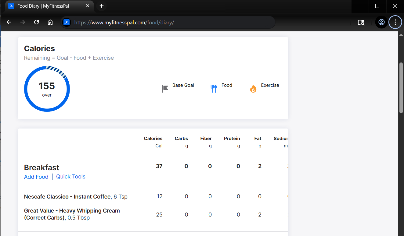
- The nutrition table is now poorly formatted, hard to read, lacks customization, and has problematic scrolling behavior.
- Navigation now became difficult due to hidden core functions and a confusing layout.
Functions that could be/have been addressed instead of the previously functional UI:
- Tracking salt instead of sodium;
- Tracking fiber (or customizable items, perhaps) in the main table;
- Tracking for caffeine intake;
- Tracking for alcohol intake;
- Tracking for supplements;
- Improved accessibility;
- Parallel/combined view table for macros and weight (or customizable items, perhaps);
I believe addressing this will not only resolve user frustrations but also reinforce MyFitnessPal’s reputation for helpful, intuitive and user-friendly design.
Thank you for considering this feedback. I am a long time user and seek only to contribute with Myfitnesspal. As such, I look forward to seeing how it continues to evolve.
Kind regards,
Le Guimarães4 -
Dear Mr. Beringer,
I hope this message finds you well. I am writing to bring to your attention concerns that are my own and by other users regarding the recent MyFitnessPal UI update. The primary issue centers on the lack of clear visual hierarchy in the new interface, which has made it challenging for users to quickly and intuitively navigate and interpret key information.
The current design presents data in a way that feels cluttered and overwhelming, reducing the overall usability and user experience. In addition to this, other grievances include:
- The app is noticeably slower with frequent lag.
- There are new syncing issues with Apple Watch and other health apps.
- The UI feels clunky and unintuitive, complicating food logging and progress tracking.
- The nutrition table is now poorly formatted, hard to read, lacks customization, and has problematic scrolling behavior.
- Navigation now became difficult due to hidden core functions and a confusing layout.
Functions that could be/have been addressed instead of the previously functional UI:
- Tracking salt instead of sodium;
- Tracking fiber (or customizable items, perhaps) in the main table;
- Tracking for caffeine intake;
- Tracking for alcohol intake;
- Tracking for supplements;
- Improved accessibility;
- Parallel/combined view table for macros and weight (or customizable items, perhaps);
I believe addressing this will not only resolve user frustrations but also reinforce MyFitnessPal’s reputation for helpful, intuitive and user-friendly design.
Thank you for considering this feedback. I am a long time user and seek only to contribute with Myfitnesspal. As such, I look forward to seeing how it continues to evolve.
Kind regards,
Le Guimarães2 -
@melliott2811 I hadn't noticed your point:
- Cannot resave entries without changing value. Sometimes I want to reorder my entries within a meal to better organize them, and I cannot change the order now without changing values then reverting them back.
I too like to change the order of the entries in my meals.
3 -
Can't even change the ordering of your saved daily food diary entries without major efforts and frustrations. If you select a previously entered food, it won't let you re-save it unless you also change the quantity value…. horrible update - bring back the old.
6 -
completely unusable and frankly laughable, hey CEO Mike Fisher - my 5th grader is available to fix things if you need help.
3 -
I also noticed when adding a note:
The note background goes grey, the text goes a different shade of grey.
Grey-on-grey: Not particularly easy to read back… (whoever signed off on this at MFP?)
Just wondering…
Should we consider a new thread titled, "Alternative sites/apps to MFP if they don't revert?"5 -
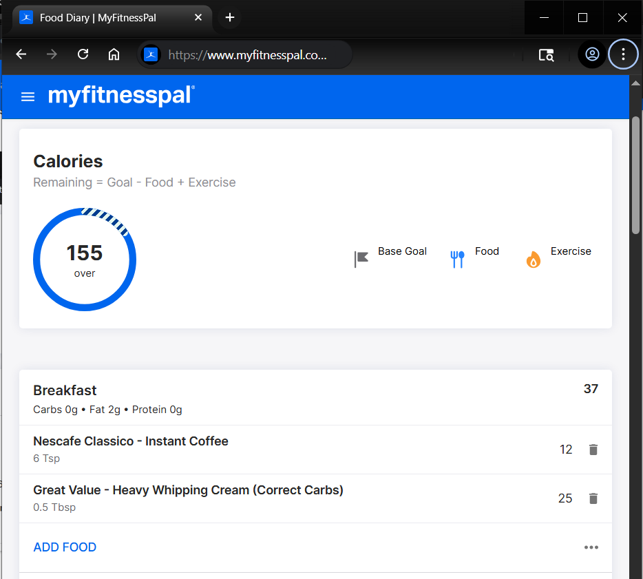
@ruby1056 @Steelpit202 Some - some folks found out that it's the browser layout, if you minimize your window and shrink your browser to be taller, like a mobile device, it'll show up the delete buttons for your diary. This new layout is geared towards mobile users and doesn't seem to have been tested for computer users.
 3
3 -
I am really angry about the new food diary. Over a decade of notes gone! Just gone- and they had info that went beyond what I ate, they really helped me process what I was feeling and needing. I'm really shocked you would take away a feature without getting feedback about what users need and want. There is nothing good about this new diary-the old one was excellent. I hope there is a way to get it back. It was actually reflective of how you view your users to do something like that.
4 -
Same! I never even knew there are a discussion board (and I am a premium member!!). This new UI is absolutely horrible - and they obviously didn't test or run it by anyone. Most sites give you the option to toggle between new and old - that would have been really nice here…
3 -
Also not the OP, but the way it's so bloated, there are no rows to help with the flow of using it, and on top of that the wasted white space is also really hard on the eyes (which is an accessibility issue for people like me who can get migraines with too much eyestrain). The goal/remaining in the diary is utterly unnecessary and I wish we could make it go away because it's more wasted space.
I've been using MFP for a long time (Premium, even) and if this is how it's going to look going forward, I will definitely cancel and look for another site. I'd hate to lose my information and l've gotten pretty used to the site because it's easier and because the app and the site don't cross populate for me anyway.3 -
- Please revert. I agree there is too much white space and totals are better at the bottom as is typical for most standard displays. The previous version was much more readable.
- I use both the app and desktop. I find the app easier and quicker for adding foods, meals and recipes. Response times are faster both for adds and deletes and I like that I can dictate a search and scan barcodes. Response times also seem faster for the app and it is easier to choose in the app than in the desktop.
- I liked the desktop for viewing what meals I had. It was simple, straight forward and extremely readable. I also had it integrated with an Excel spreadsheet such that I could do a copy & paste. The new field arrangement defeats current programming. Additionally meal descriptions are not copy-able.
5 -
I detest the new format. I don't want a massive calorie counter or a bleddy pie chart, I want my macro totals! This just makes using it irritating rather than helpful. Will switch to something else if nothing's done about it.
4 -
the new layout is SO difficult to visualize. why have you changed something that worked so well?
4 -
I agree with the above. The right side of the screen cuts off and you can't even see the full diary. It's very clunky. I also do not have a visible option to delete entries. Also the drink category is very limiting. My usual addition is 120z. There is no customization tab! Very clunky. The new version is not user friendly.
4 -
The new format is terrible. Too spread out, which makes it difficult to read. Everybody hates it. Check out all the complaints on Reddit. Just go back to the old format.
3 -
how am i suppose to delete food diary entries? no trash can on right hand side, old version was waaay better.
2 -
Can't edit an entry now once it's in there, e.g., I planned for 250 g honeydew, ate 150, edit the entry, hit save, nothing changes. WTF you guys, I feel bad for whoever designed this and I'm sure they had good intentions but this has some basic functionality issues that are really making me look for another tracker and leave behind over a decade worth of data and use.
3 -
looks like i am going to have to switch to another app, if this isnt resolved, it is useless if it doesnt work properly. its a shame because it was great until today
3 -
Me too. This new format is just so terrible I had to find a way to express my unhappiness with it. Please go back to the old format or at least give us the option to choose which one.
3 -
Never thought i would comment in myfitnesspal at all, but the new optics is a reason not to use it anymore. Who thought that was giving me a quick overlook? This looks like someone insisted on making something for mobile, but bad.
Edit:
 6
6 -
In an email I sent to complain they straight up said it was to "bring it in line with the Android/IOS App"
Ludicrous - web versions must be designed with PC use in mind. Landscape monitors and more space to work with. Mobile versions are inferior.
7 -
As a new user since January I've been raving about MFP and it's functionality. This is no longer the case and I'm compelled to add my vote to change it back to the prior version. This "update" is absolutely awful.
3 -
Here is my 2 cents:
- When I click to edit an entry and change the value and press the Enter key on my keyboard or numpad, it won't register the Enter key, I have to use my mouse to save the entry, this is really annoying. It was possible to just press enter to save my entry on the old layout
- Again, when editing an entry, it won't accept 0 (zero) as a value. I like entering 0 sometimes, as I don't want to delete a certain entry entirely so I can revisit/re-use the same meal the next day. Now it won't let me enter 0
- Spacing between entries is a bit too much, causing me to scroll more than usual.
- Blue color font for certain words and sections like the total calories and macros per meal (like in the old layout) was really helpful
- Total calories and macros per meal are now at the top instead of at the bottom.
- I could copy a meal from a friend without any problems, now I get an error every time I want to do that
- Also overall there are some bugs, random actions won't register and give this error: ''There was an error processing your request. Please try again later. ''
2 -
Have to add to the pile on that I thought the new layout was a glitch or a problem with the content management software. If this is on purpose I'll to be keen to move my premium subscription elsewhere. It's bloody painful to look at. And why is the water tracking widget gone?
The previous version was enormously better - I feel like I'm looking at the screens from Severance.
 4
4 -
6/25/25 - 2:45 pm PST …. Yayy!! It looks like MyFitnessPal did listen to all of us frustrated users and they have now brought back the old proven standard version. Let's all hope that it stays that way but Thank You to everybody who made their thoughts known & ultimately heard by the corporate stiffs.
7 -
Thank you all for posting and sharing your feedback about the new Diary on MyFitnessPal.com. We found a bug in the new experience that needs fixing, and we want to make sure everything runs smoothly for you in the meantime. So our web team will temporarily roll back the diary to the previous version you’re more familiar with sometime later today. While we fully understand that the back and forth is not a great experience by any means, once the bug has been fixed, we expect that the new diary layout will return.
We have noted your feedback regarding our new diary layout and are passing it along to our team working on the website.
0 -
Mine went back to the good format !! 😃
2 -
3:00 pm - I spoke too soon. - The old version is now gone again and MFP came out with a reply saying that they are planning on staying with the new crappy version after they "fix some bugs" - UGHH!!!
6/25/25 - 2:45 pm PST …. Yayy!! It looks like MyFitnessPal did listen to all of usfrustrated users and they have now brought back the old proven standard version. Let's all hope that it stays that way but
Thank You to everybody who made their thoughts known & ultimately heardby the corporate stiffs.
2 -
Mine switched back briefly, and now it's back to the new s(*# show.
1 -
Wait - you reverted to the format users preferred but are bringing back the "new" version? Please please please reconsider. It's truly unpleasant to look at and offers a poorer user experience.
5


Categories
- All Categories
- 1.4M Health, Wellness and Goals
- 396.6K Introduce Yourself
- 44.2K Getting Started
- 260.8K Health and Weight Loss
- 176.3K Food and Nutrition
- 47.6K Recipes
- 232.8K Fitness and Exercise
- 449 Sleep, Mindfulness and Overall Wellness
- 6.5K Goal: Maintaining Weight
- 8.7K Goal: Gaining Weight and Body Building
- 153.3K Motivation and Support
- 8.3K Challenges
- 1.3K Debate Club
- 96.5K Chit-Chat
- 2.6K Fun and Games
- 4.5K MyFitnessPal Information
- 16 News and Announcements
- 18 MyFitnessPal Academy
- 1.4K Feature Suggestions and Ideas
- 3K MyFitnessPal Tech Support Questions