Food Diary
Replies
-
Visually unappealing to look at and disorientating. Floating numbers in lots of white space is not easy to read or when looking at a glance. If you added some borders and more colors it's probably alright, maybe?
7 -
I also HATE it. Why on earth did you change it when it worked just fine??? Please change it back or at least give us the option to revert back to the previous interface.
Besides the change in font and spacing and totals, another feature I have lost is being able to move previously entered food items to the bottom of the meal. I often need to change the order of the items I have entered in a meal and used to be able to do it with no problem. I can select the item and move it to another meal in the day's diary (for example, from "Dinner" to "Lunch"), but can't move it if it's still staying in the same previously entered meal. I don't want to have to delete and then reenter each item I need to move.
13 -
Same here. Not all of us are under 50s, and I'm disabled, so have no need to use my phone 24/7 since I'm essentially housebound except for medical appts. I also need the info to be clear for insulin dosing and protein restrictions.
11 -
I don’t like it either. All of the comments in this thread are relevant, plus, unless I missed something, I don’t see the information for the specific nutrients that I selected. I checked the Settings for my account, and they have not changed, but I can’t find this information.
there are so many issues with this new format, I wonder if the programmers who wrote this new program actually use My Fitness Pal. Otherwise, how could they make so many senseless changes?11 -
yes I liked to see all my food descriptions in 1 line too as before, makes everything neat and clearer to read. now everything big and takes the whole page is just terrible
9 -
new format is amazingly bad with a casual glance at previous vs current. I assume, MFP intends to completely fill all of the white space with huge swaths of advertising to force people to either join, or find something else, or just live with the horrible new format that is so incredibly difficult to even read. Truly incredible step backwards. None of the other issues with the site have been at all bad enough to make me even bother to comment, but this one is soooo bad. And incredible, that it seems the moderator hasn't a clue. I guess the moderator didn't even know that anything had changed at all. Anyway, I am sure MFP doesn't care what I think and I wasted my time writing all of this.
10 -
Could we at least, have the header stays static? So that I know the numbers are belonging to which column: calories carb fat etc etc.
10 -
Can you offer an option for those to use the old one?
16 -
Also, the diary sharing is bugged. It says password incorrect, even after I change to a new one.
3 -
Dislike the UI as well. I have a PC open at all times in the kitchen, so I use the Web UI a lot. Very disappointed, wonder why I keep paying every year when they bring us new features we don't ask for, and they don't solve the bugs they acknowledged years ago.
10 -
Not only is this new format awful but it now duplicates my entries into the afternoon and evening snack section. When I deleted the unwanted entries, it deleted them also from where they were supposed to be. After 10 years, the food diary is useless to me unless they fix this. Please bring back the old working format.
12 -
I could be mistaken as the new format makes it difficult to see the entire entry set up, but I'm not seeing the delete button? I just tried to edit a meal that I'd saved in the past as I didn't order everything that was listed in the original entry, I couldn't alter the portions as I have in the past, and I couldn't delete an item. If these options have been removed permanently I may as well bow out because editing what I eat is important, as is editing the portions. Thank you. I know change is hard, I get it, but if the format no longer provides the basics of what people need then it's not going to be successful.
11 -
Change it back. New format is not user friendly. I’ve been using the Web Site for 11 years with no problems. Now I can’t recommend your platform any longer with this mess.
14 -
Someone must really want to run off the members here, to change the Food Diary to something that terrible. Hope you are listening and can reverse this terrible change. What were you thinking?
14 -
This new UI is so difficult to see across the table. I loved the ease of glancing across the entries on the original layout. This all-white approach is not user friendly. Nothing to help guide the eye along the page. It's 'plain ugly' for sure.
12 -
In the new format, I can't even delete entries. How would I do that?
7 -
I don't know how anyone would think this new layout is better than the old one.
10 -
ive used MFP for 10 years and will switch to another app if you don't revert to the old BETTER format
9 -
The new layout is horrible, just a bunch of floating numbers! I've used MFP for practically 10 years and the layout has never changed and that was a GOOD thing. It was already perfect. Please change it back or I'll have to stop recommending this to everyone and their mom. Seriously. How does stuff like this get through Quality Assurance?
11 -
I agree with all the above comments. Yuck!!! The new format is awful and was an unwelcome surprise when I logged on tonight. I hope you'll give us the option to return to the old format.
8 -
I agree I really dislike it. Very hard to read. UI updates should increase readability, not hinder it. I'm all for trying new things but this ain't it.
9 -
Updating websites so the same data takes up twice the amount of real-estate on the page and requires scrolling is a DOWNGRADE. Please UX teams stop doing this to perfectly readable websites!
10 -
I've read all of the comments about the "NEW" format for the food Diary and not 1 comment was positive!!!! Add me to the list of MyFitnessPal users that do not like the new layout and want the old one back.
IF IT AIN'T BROKE DON'T FIX IT!!! IT WASN'T BROKE, BUT YOU FIXED IT ANYWAY AND MADE IT WORSE!!
10 -
Wow, one of the worst redesigns i saw in the last 20 years. Turn it back, fast, or i move to another tracking service - after nearly 10 years of usage.
11 -
So, if you drink a 12 oz. can of soda you have no preset (or customizable) value to choose from? I guess you will also have to do the math in your head and revise your daily fluids total in that situation…. Visually annoying and very inefficient 😝… Absolutely terrible! … Please bring back the old version ASAP!!
6 -
For the love of all that’s holy, put it back the way it was!!! It was perfectly fine for over a decade!
(Also, I can’t even complete my entry for the day — the complete button doesn’t work!)
6 -
I agree with all the comments above, which already explained why this design is bad. For each item they listed, I agree with it. I am not against updates per se, but this one is completely user-unfriendly.
Didn't you test it with some of your MVP members who actually use the website?
Please bring back the old one while you figure out what a user-friendly update should look like.
6 -
Haven't been here in a few years. Just came back to see if everyone else was experiencing the same diary page I was. Ugh. Please give us the option to switch back to 'Classic'!
9 -
+1 on requesting a rollback. The new UI is an objective downgrade.
I will speak specifically about the Food Diary page, as that's the only page I ever use, but the user experience has been severely negatively impacted by me (I use desktop):
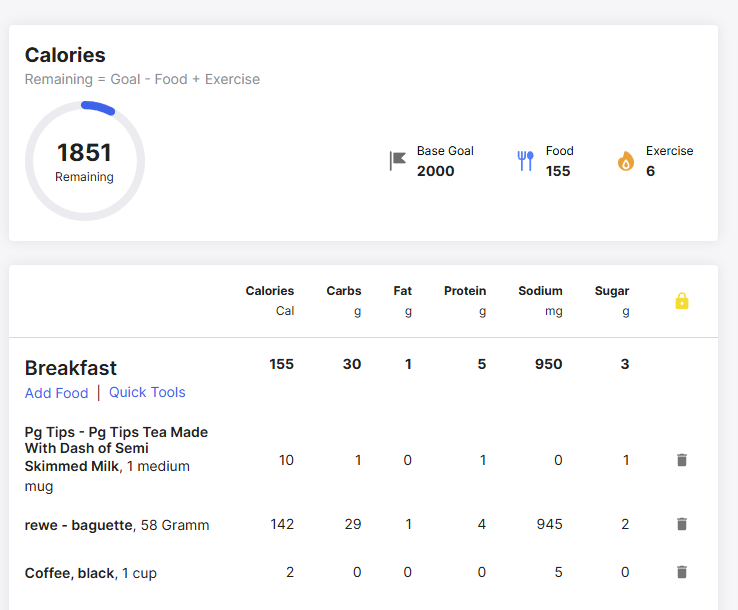
The previous UI was concise and offered a table-like design for the different meal groups, which meant all calories, carbs, etc on any given food item could not only be read near-instantly, but also near-instantly compared to other items in the same or even other meal groups, due to their proximity. It was like having a spreadsheet pre-made for you. Each row also had a clearly visible line distinguishing it from the next, which aided in its ease of use.
The new UI is extremely bulky, with lots of negative space between entries, just about every food item needs to wrap-around making rows taller, and no item has a grey backing or any kind of line to differentiate rows within meals (only meals themselves), needlessly complicating the process. Furthermore, all the wasted space and the font change means that I now have to zoom out to 75% just to get MOST of the same information I used to get before at normal zoom - and even then, I still have to scroll down to see the full list.
I don't know who OK'd this change but it is clearly a massive downgrade in usability, legibility, and application.
11 -
Honestly, I would take what you are seeing over what I am seeing… - Mine looks even more "mobile" and I can't seem to even get what you have. My text starts to wrap after 26 characters from what I can tell and, bearing in mind I am on a QHD monitor…that box is just dumped in the middle of the screen like I have ended up on the mobile view. I could genuinely fit another 3 copies of this into the whitespace around it….
I can't find any configuration options to adjust it, or any indication as to why mine looks even worse. I am on a Chromium based browser (Vivaldi) if that makes any difference.
It's an awful UI change to force on people with zero customisability
9


Categories
- All Categories
- 1.4M Health, Wellness and Goals
- 396.6K Introduce Yourself
- 44.2K Getting Started
- 260.8K Health and Weight Loss
- 176.3K Food and Nutrition
- 47.6K Recipes
- 232.8K Fitness and Exercise
- 449 Sleep, Mindfulness and Overall Wellness
- 6.5K Goal: Maintaining Weight
- 8.7K Goal: Gaining Weight and Body Building
- 153.3K Motivation and Support
- 8.3K Challenges
- 1.3K Debate Club
- 96.5K Chit-Chat
- 2.6K Fun and Games
- 4.5K MyFitnessPal Information
- 16 News and Announcements
- 18 MyFitnessPal Academy
- 1.4K Feature Suggestions and Ideas
- 3K MyFitnessPal Tech Support Questions