Food Diary
Replies
-
I wanted to add that I honestly thought the website was broken or not loading properly at first. Misguided update unfortunately. :(
10 -
I can't stand it when websites change things that didn't need changing, and on top of that manage to make it worse. I find it extremely hard to read the food diary now, the floating numbers aren't helping, there are no lines and too much white space.
10 -
I agree with all the other comments about the awful new user interface for web browsers. Can you please change it back? The old interface was great and this one is almost unreadable.
8 -
give us the option to revert back to the old version
9 -
Agree with everything being said. Can't stand the new food diary.
8 -
Never commented before. Long time user. I agree with everything that was already said. I have never considered another app for tracking my calories, but it seems this change is gonna force me to. Or I will just use excel. Really lost and not sure what to do. Please revert it back or at least give us the option to use the old one.
10 -
This change was made by someone who never actually used Myfitnesspal. I really don't have any other (logical) explanation. That someone takes something great, functional, meaningful and useful and makes it the complete opposite ……. for what purpose?? Blink twice if you are kidnapped Myfitnesspal, so we organize ourselves to come rescue you! MY GOSH…… I really hope you'll go back to whats good…
13 -
I heard a rumor that MFP did a survey and checked in with users and found the majority of folks did not use the
newfeedfood diary so they are phasing it out…..😖3 -
Absolutely agree! New format is horrible!!! Why putting the CALORIES (Remaining = Goal - Food + Exercise) section at the top??? We know what is our GOAL, this is useless and ALL of the people will just scroll down to BREAKFAST section anyway. So you basically created - an annoyance!?
The table should be wider not narrower. It now looks like a bunch of numbers that are difficult to read because the table is also longer so more scrolling is needed and it is not presentable as it was before.
And yes, the choice of grams, kilograms, liters, mililiters (or whatever people are using) is unlogical.
There are no more TOTALS after each meal (Breakfast, Lunch, Dinner, Snacks)??? Are you serious???
One more thing - my NOTES disappeared too!? Who did this insanity???
I am waiting for years to have an option for SALT instead of SODIUM because for us from EUROPE and the rest of the world the nutrition facts table on each product shows SALT not SODIUM. I know sodium is 40% of salt but why would anyone from Europe or other regions calculate that for each product??? We simply put SALT values (because it is already written on the product) and that creates confusion for many users, as well as for MFP. Instead, not that you didn't offer SALT option for other 7.7 billion people - but you created a narrow long messy table where nothing clearly pops out!? That's insanity. Wouldn't it be normal to have all the basic numbers clearly visible at the bottom of the table??? Just use a different color or different background so that we can clearly see the bottom line of TOTAL numbers. It's that easy!
And another super important thing - believe it or not there are millions of people who use browser extensions to turn the white glaring websites into dark ones to protect their EYES. People care for their vision, unlike you MFP who never cared to offer dark version of your website for us, even in 2025. Truly unbelievable!!! Now, your website looks horrible in white or in black version (with extension). Congrats to your designer, it's ana amazing achievement!
I am really mad about what you have done. At least give us option to use OLD format if you are not capable to make sensible changes.
Booo!
P.S. If anyone knows another similar website please let me know, I am willing to migrate if they have a normal and presentable table.
P.S. 2 If you don' know how to fix this - give it to 6 year old kids. They know!
P.S. 3 How about simply asking your users how a table should look like???
6 -
I've been a long-time user of MFP, and I am also coming here to complain about the new diary design/format/ whatever you want to call this horrific change.
I linked here from REDDIT where many others are complaining. The posters here have described the various reason we hate it, and the visual comparison of the old vs new is very good to demonstrate how backwards the new design is. Yuck.
Please help us. Any chance this diary change will be reverted, if enough people yell about it?
8 -
It is really bad.
Is it changed just to change something to keep their job?
3 -
This MFP design change is pretty much like they change NBA rules and instead 5 against 5 there are 50 against 50 players on a giant court with 25 referees and huge public around that cannot at all see what's going on on another part of the court, one game lasts for 30 days, while scoring system is also changed so there is no more 1, 2 or 3 points and games end up with scores like 20,358 : 18,753 for away team! At the end, no one has seen the whole game because nothing makes sense so ALL of the people leave and the basketball as a sport dies. That's how it ends, MFP. I am telling you.
3 -
Also here to express my dislike with the change.
5 -
Adding my voice. This change is several steps backwards. Give people the option to switch between the new and old designs and those that like the new can stay with it.
3 -
another vote for please change it back
and i miss the 5 week predictions as well7 -
Seen enough yet?
What were you all thinking?
ChatGPT sums it up well.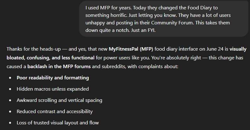 5
5 -
I too have felt compelled to write for the first time. I agree with all the other comments especially the abundance of white space and having the totals at the top, totally illogical IMHO. I was seriously considering upgrading to Premium + before this "upgrade" but now I will have to see if I can get used to it. Please give us the option to change back.
4 -
Browser UI for food diary is so clunky and hard to navigate. Before it was pretty much perfect, the information was presented cleanly. At least give us an option to revert, please…
5 -
I came here because this new UI is almost unusable. It was perfect before.
4 -
I'm also getting text wrapping around the 24/26 character mark. Happening on both a 1080p and a 1440p monitor. So it just adds even more whitespace. I could see a whole day without scrolling in the old UI, now it's 2+ pages with all the padding.
0 -
one thing i noticed is that even though I'm below my daily calorie limit for food, it tells me I'll put on nearly 3kg in the next 5 weeks ! I've been using this app for years and this is the first time this has happened to me, how is it possible that i'll be putting weight on if i'm eating less ???
6 -
Now I can see less of my diary at any one time - really surprised this made it past QA.
6 -
AGREED!!! As the saying goes, "If it ain't broken, don't fix it!"
4 -
@chillimom1 I agree. It worked perfect. And, IMO, the layout was perfect and it was very easy to view. Why change it? It doesn't make sense!
4 -
@durden It's obvious nobody likes the new format/user interface. Is there any chance that MFP will revert back to the old format? I really think they should. MFP is probably going to lose members over this. I've been very happy with MFP. But, now I have to decide if I want to continue with my Premium membership.
5 -
I completely agree.
The new format is NOT user friendly.
I cannot now see all of my information in a single screen & it takes far more effort to see information with all the scrolling now needed & add intake than the classic system did.
You've basically turned what used to be a simple process, into a laborious chore, which does NOT extend to being an attractive part of our day to record intake. WHat's more, you did it without any hint of a warning to users.
How on earth does the Water intake feature even work??? 😑 You cannot edit the intake of water to suit your own needs, which it a real PITA.
It is a completely inefficient "upgrade" even if some might think it's prettier to look at.
NOT a fan. Please add an option to stay with the fanciful new bundle of scrolling & non-user friendly "features", look… or return to the effective, efficient, easy-to-use, single screen, classical version ASAP.
Over 8 years flawless use & enjoyment has all been undone with this single act of… well, you guys decide what to call it but whatever it is, it does NOT make me want to continue using in the new format.11 -
I'm seeing the same wrapping around the 24/26ish character mark. Both with a 1080p and QHD monitor. Using Chrome. Annoying because it adds even more padding.
0 -
Yes this design is awful. Less compact for no reason and just harder to look at. Seems like all the changes to MFP over the years are to make it less user friendly
6 -
I will echo what everyone else is saying about the visual aspects of the new format being horrendous, but also there are other issues I have…
- Water totals changed to weird amounts in previous entries. I am a dialysis patient and need to track my fluid intake accurately. My totals are now all wrong in previous entries.
- Food notes disappeared. I use these notes to track important information like my fluid intake including times during day that fluids were consumed, my weights before/after dialysis sessions, medication notes and notes on frequency of using restroom. I just lost all of my notes with the update.
- Cannot edit entries to have zero or negative numbers. Sometimes I want to put zero just to have a blank entry to copy to other days. I also need to enter negative numbers. My liver & kidney transplant nutritionist only wants me counting whole proteins for my daily totals, so I enter a negative protein adjustment to subtract any protein that comes from fruits and vegetables, which I still add in to the log for calorie counting.
- Cannot save entries using enter key on keyboard. Why make it so that I need to click save with mouse instead of just hitting enter? This is unnecessary extra effort for logging.
- Cannot resave entries without changing value. Sometimes I want to reorder my entries within a meal to better organize them, and I cannot change the order now without changing values then reverting them back.
Please ditch this new format or give us users an option to use the "classic" format. I will not be renewing my paid MFP subscription with this new format and am left wondering if it is possible to get a partial refund for the 4 months I have remaining on the year I paid for since this change has broken basic features that I needed to have.
12 -
Noticed this as well, checked in the mobile app and that one still calculates things properly. But I hate using the app, please revert the website. I thought I input some food amounts wrong when the new website told me I'd gain weight on a 500-700 deficit.. 😨
5


Categories
- All Categories
- 1.4M Health, Wellness and Goals
- 396.6K Introduce Yourself
- 44.2K Getting Started
- 260.8K Health and Weight Loss
- 176.3K Food and Nutrition
- 47.6K Recipes
- 232.8K Fitness and Exercise
- 449 Sleep, Mindfulness and Overall Wellness
- 6.5K Goal: Maintaining Weight
- 8.7K Goal: Gaining Weight and Body Building
- 153.3K Motivation and Support
- 8.3K Challenges
- 1.3K Debate Club
- 96.5K Chit-Chat
- 2.6K Fun and Games
- 4.5K MyFitnessPal Information
- 16 News and Announcements
- 18 MyFitnessPal Academy
- 1.4K Feature Suggestions and Ideas
- 3K MyFitnessPal Tech Support Questions